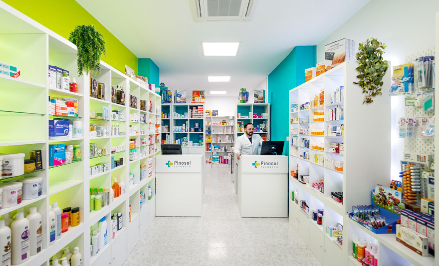
Pinosol pharmacy has been in existence for over 40 years, however it is clear to the owners that an important change in the company must be communicated and conveyed to the public. For this reason, he decided to carry out the full renovation and the pharmacy design of his pharmacy in Malaga.
The generational shift in this pharmacy near Malaga’s city centre was first reflected in a rebranding of the business, followed by space branding with the implementation of brand to space.
corporate brand and pharmacy interior design in Málaga
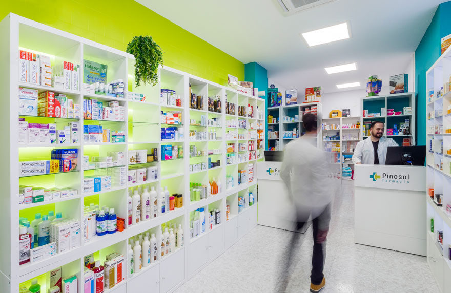
First of all, the pharmacy’s new philosophy seeks to express the vitality and dynamism of the younger generation, without losing any on its original warmth, professionalism and the feel of being part of a tight-knit local community.
The naming of the brand refers to the local neighbourhood, emphasising the feel of belonging and involvement in local life.
For the graphic design and the pharmacy design in Malaga, corporate colours are selected to bring freshness to the brand.
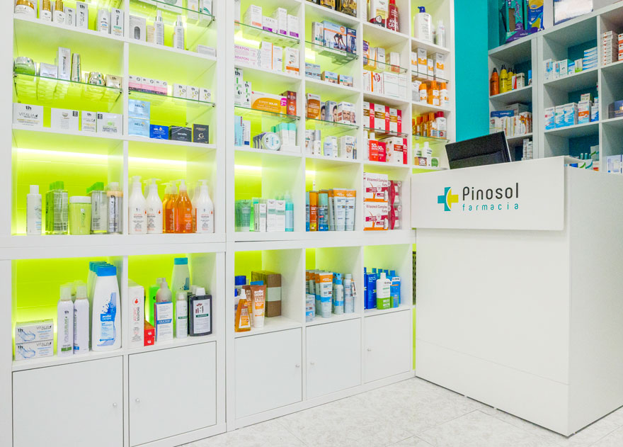
The green colour is typical of both pharmacies and the green areas that predominate in the neighbourhood. This colour goes along with a yellow reminiscent of the sun, the ‘sol’ part of the naming and a characteristic symbolic element of the city of Malaga.
objectives of full renovation
With the business having been transferred recently, the project represents a great challenge of both strategic and economic design. It is essential to communicate the transition to a new era in the company, whilst adjusting the investment of full renovation to the maximum.
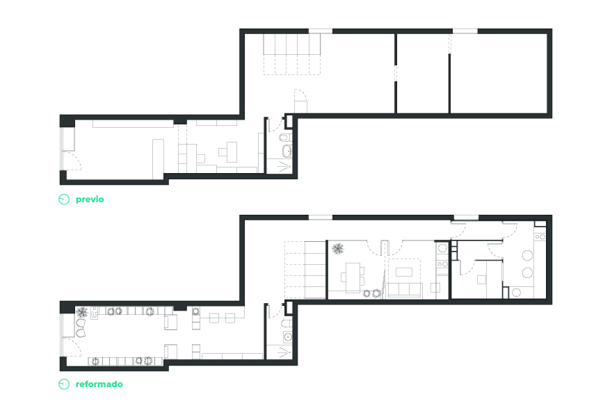
It seeks to optimize space circulation, introduce new uses, improve well-being and increase productivity through the interior design of the pharmacy and the full renovation undertaken.
strategic interior design in the pharmacy design
Thanks to the new layout, it is possible to enlarge the sales area for parapharmacy and double the counters and workstations, making a direct impact on the financial performance of the company.
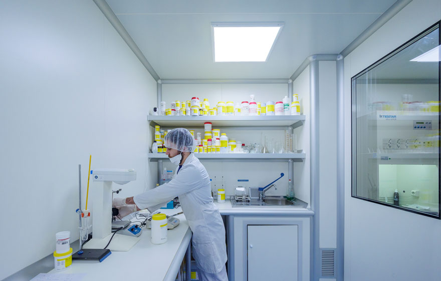
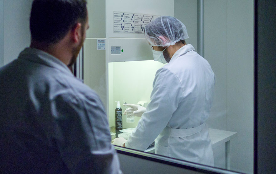
In addition, a new use is introduced: “the white room”, fully equipped and whose space is completely independent from the rest of the premises, thus offering a new service to customers and resulting in a new source of income.
The strategic interior design aligns the pharmacy’s business strategy with the interior design of the commercial premises and corporate design of the brand.
comfort and well-being in workspace
Natural light is integrated, leaving the sales room open to the outside with a fully transparent window and complemented by artificial lighting based on concepts of visual comfort, uniformity and well-being. Indirect lighting is also included for lighting and value-setting of products.
Thermal comfort was another objective of the project, incorporating an air conditioning system that allows a thermal zoning from the entrance area.
The introduction of vegetation in the workspace and commercial area is proposed, in order to humanize the space and contribute to the mental wellbeing of workers and customers. This, in its turn, contributes to an increase of productivity and sales.
result of interior design of the project
The result is a substantial improvement of services and a projection of the brand image to users: a clear example of space branding. Every choice in the design goes along with the human feel of the brand, as well as with a business that keeps evolving alongside its neighbourhood and the city at large.
