Málaga Pack launches out to renew its corporate image. Geometry, cleanliness and freshness will be key in the new brand identity.
point of departure and business strategy
This Malaga company specializes in packaging. They sell boxes, envelopes and packaging to both private clients and companies, while providing them with advice.
The fast, decisive and adaptable way of solving the needs of their clients has made them earn a name in the city of Malaga.
Its differential is based on the ability to manufacture custom packaging from one unit without a minimum order, within a very competitive market but unable to offer limited quantities.
genesis of the corporate image
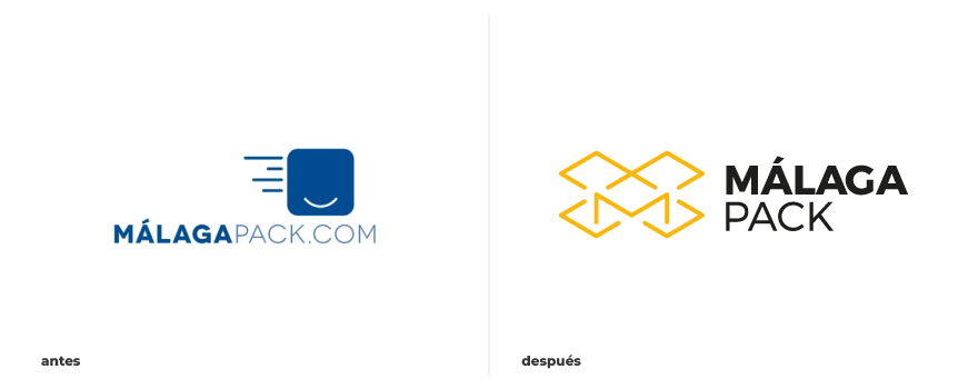
According to its business strategy, a brand focused on local commerce is created. The emphasis on the initial of the city of Malaga makes this a key point for the redesign of the brand.
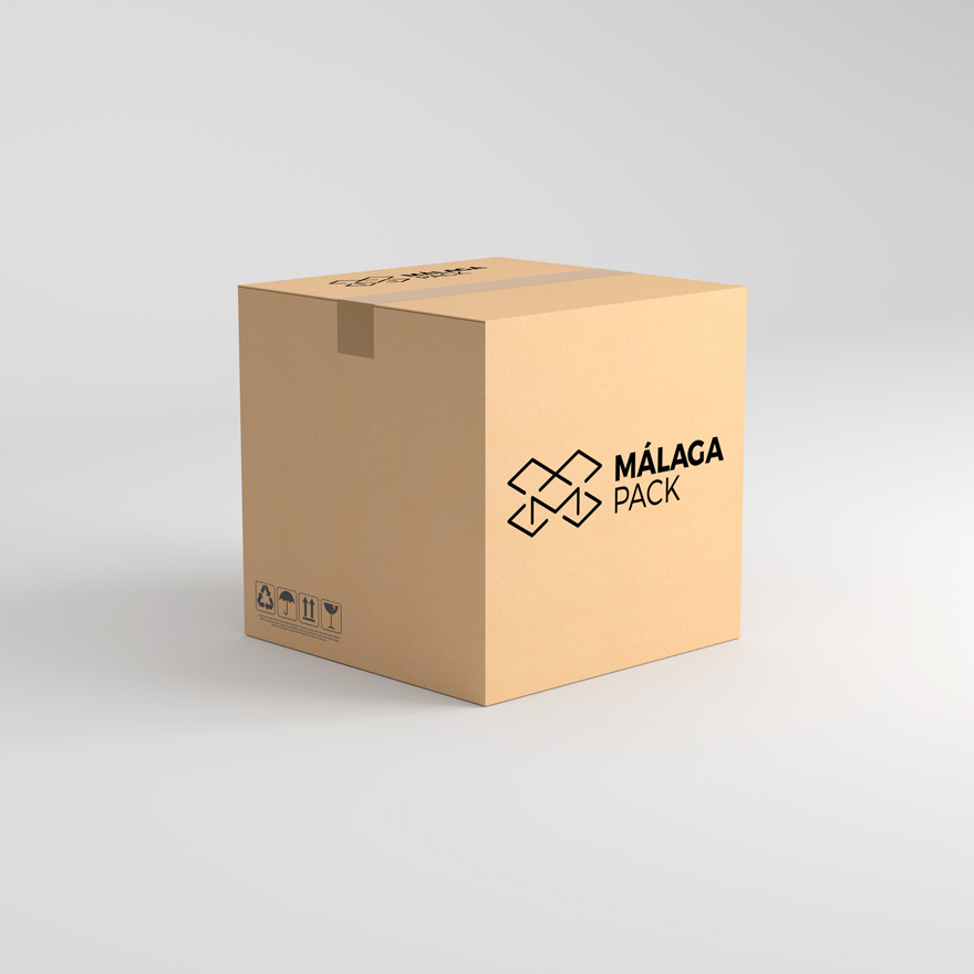
At that starting point, the initial of the Malaga city is not alone, but it is essential to create context by introducing the box element. An element already rescued from the previous graphic identity and that directly transmits the work of the company.
However, in this case the box is shown open, unfolded, alluding to the concept of custom manufacturing.
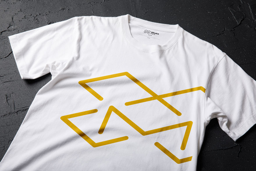
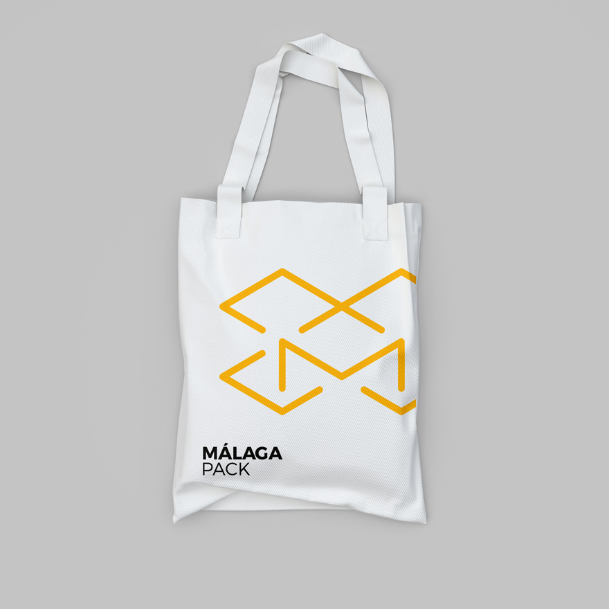
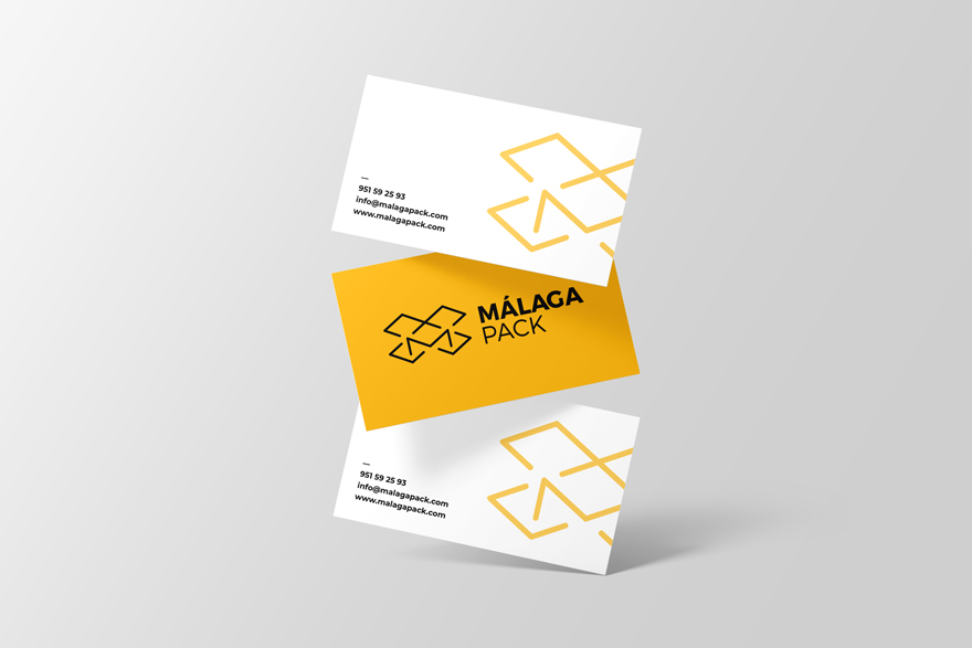
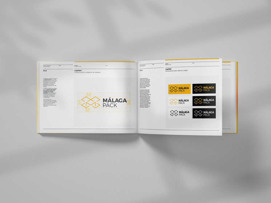
A geometric isotype, symmetrical and full of angles that, far from being challenging, manages to convey closeness and friendliness thanks to its rounded corners and encounters.
The use of colour reinforces the feeling of sympathy and liveliness, concepts linked to the essence of Málaga Pack and the brightness of the city. As a result, an image type composed of the clean and daring isotype, which accompanies the company name.
At this point, the city of “Malaga” is again highlighted using the same typeface, but with a greater weight. A fresh, vibrant and direct brand universe.
the brand universe
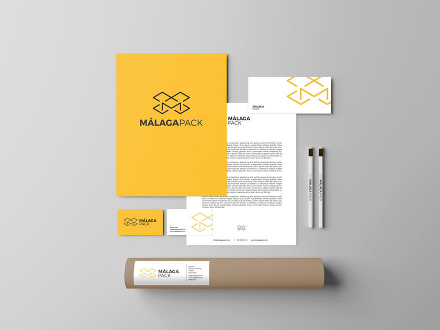
The brand universe is not only transferred to various applications such as business cards, boxes and packaging, office supplies and textiles; rather it reaches all facets of the business.
Branding overhelms the entire space with the office interior design and the design of the bespoke furniture, accordance with the brand concept. As a result, a 360º space branding project that we will soon be able to show you in a comprehensive way.
If you are interested in the concept of corporate image applied to space and office design, we invite you to continue discovering other space branding projects on our website.