The ecommerce design for the Pinosol pharmacy online store was considered from the beginning as an extension of the spatial branding designed for its physical establishment. The interior design was inspired by its graphic identity, where the use of colors and the optimization of space were decisive. You can see the interior design for the Pinosol pharmacy here.
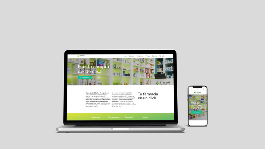
Taking the interior design of the establishment as a reference, the design of an ecommerce was developed that would continue with the discourse of its corporate image. A fresh, intuitive and close portal.
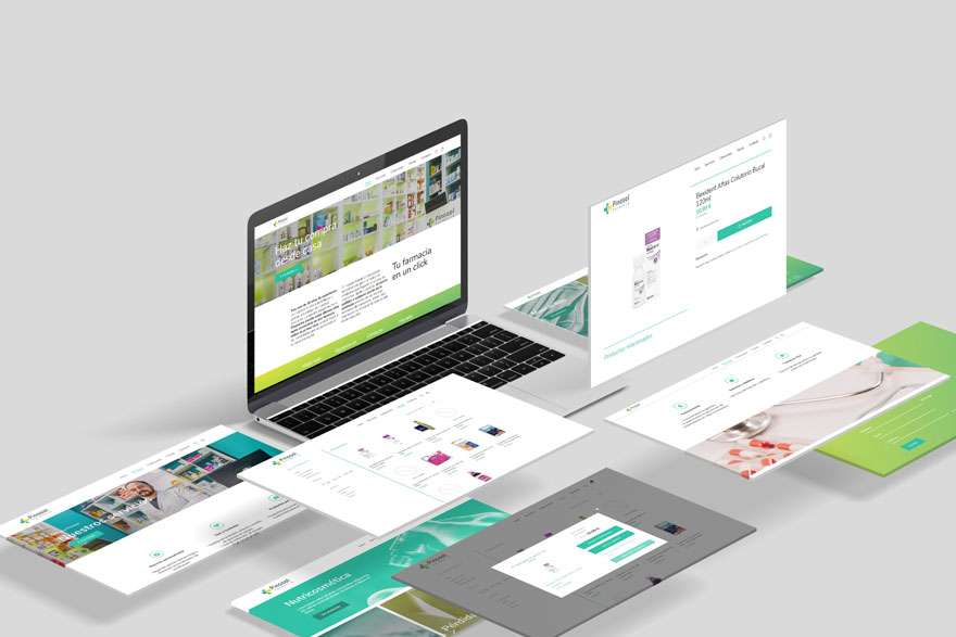
A new virtual access to a pharmacy that has more than 40 years of experience. The step towards the vitality and dynamism of branding demanded the leap to technological updating. A web design that does not lose the neighborhood character with which this business was born.

In an environment full of screens, you cannot understand a web design without having the ability to adapt to any screen format. The responsive design that helps Pinosol Pharmacy to reach anywhere and at any time on a daily basis.
If you want to know more about other graphic design projects, you can continue visiting our website. You can also keep getting to know us through our space branding, office design and housing design projects.
