Miraflores de los Angeles College decides to renew its image, starting with the new logo design of the school. The identity of the neighbourhood, the use of colour and the freshness of childhood will be the keys to the new brand identity.
starting point and context
This public school for infant and primary education was born with the particularity of being the first building within the Malaga neighbourhood of Miraflores de los Angeles.
It is the building that generates what was called to be a great working-class neighbourhood. In addition, its position among large blocks of brick buildings, causes it to be perceived as the heart of the neighbourhood.
With more than fifty years of history and a marked intercultural character, the centre decides to renew its image towards the neighbourhood and towards the students themselves. A new corporate design is developed, whose objective is to transmit the essence of the school and transfer a positive image of it to the neighbourhood and to the city.
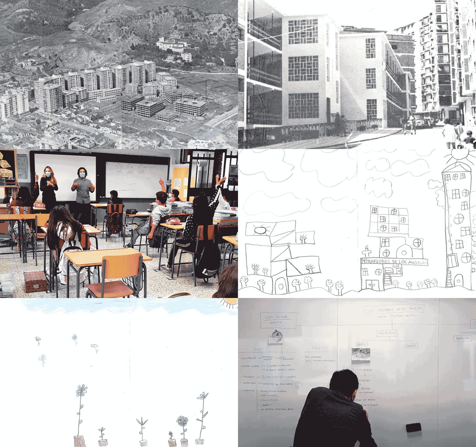
As a starting point, collaborative workshops are held with the students. It is possible to involve the entire educational community, so that they dream about the school and feel part of the change.
In this way, a greater sense of belonging is generated, while the students themselves enrich the project and develop critical thinking.
the origin of the school logo
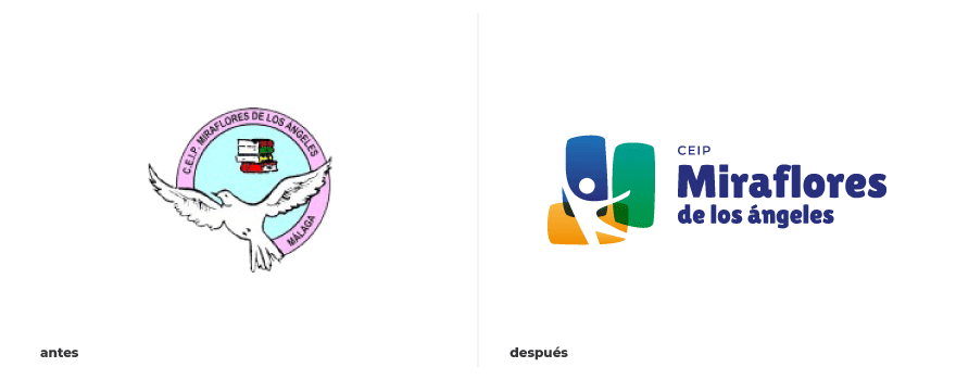
The origin of the renewal of the school’s corporate design is the new logo design.
Starting from the close relationship of the identity of the school with its environment, the following concepts are taken into account:
• Multiculturalism and diversity
• Original elements of the building itself (stained glass)
• Situation of the school with respect to the neighbourhood
• Denomination of the neighbourhood (“M” for Miraflores)

childhood
First, childhood, in its broadest concept, is taken as the starting point as the true essence of the centre.
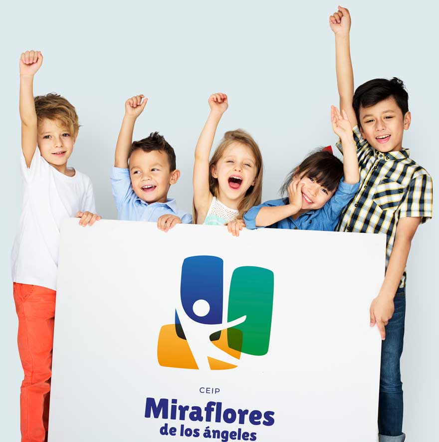
Consequently, it materializes in the integration of a generic infantile figure in the logo. The infant’s silhouette brings joy, movement and dynamism, while at the same time fostering respect for diversity (cultural, family, functional, sexual, etc.).
the materiality of the school
On the other hand, from the beginning the brick and the stained glass were around in the process of generating ideas of the project. The exposed brick, so representative in the construction of the neighbourhood, is present as a construction system both in the school and in residential buildings.
Furthermore, the “brick” also represents both the desire to “build” qualified and respectful people, as well as the physical identity of the building.
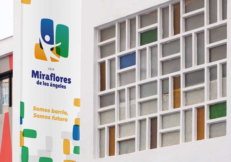
Finally, the shape of the window is taken as a graphic element. Valuing an “original” element, both for its presence since the construction of the school and for the interesting composition.
The stained glass window manages to transmit the humility, diversity and freshness of the school, and at the same time connect with the neighbourhood and its origin.
The position of the “stained glass windows” within the logo hint at the essence of the school as the heart of the neighbourhood, located between the “wall buildings”.
Finally, this identity is transmitted in turn through the use of colour. The inspiration for his choice continues to be the large windows that the building has in its stairs, so characteristic of the centre.
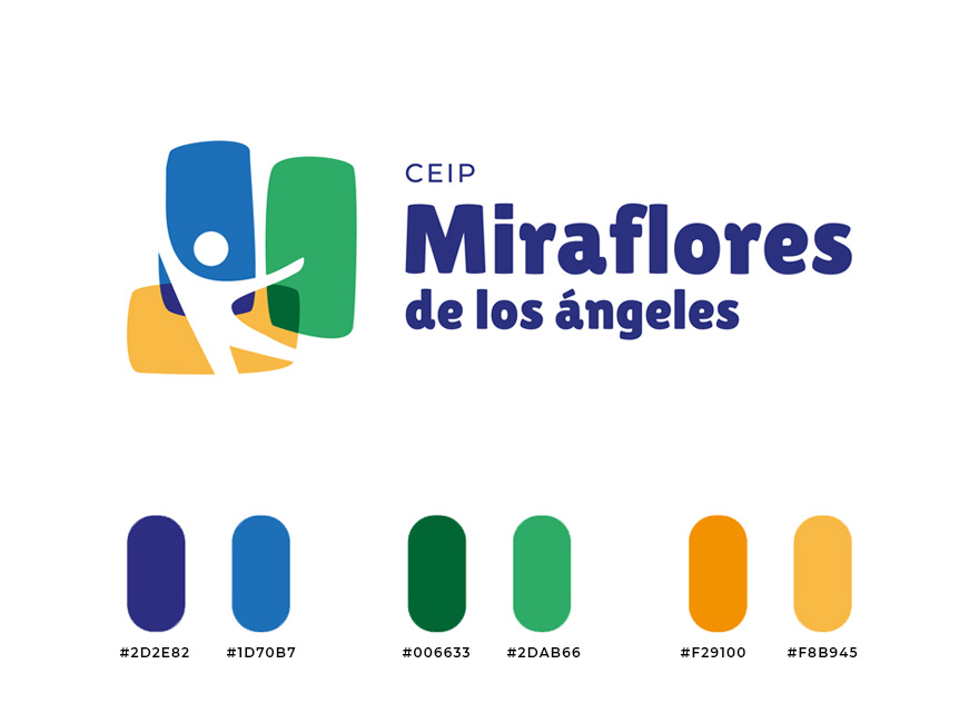
The primary color palette succeeds in consolidating the school’s corporate design as a young and carefree identity. Qualities that are reinforced through the typography used: striking and cheerful.
from the school logo design to the brand universe

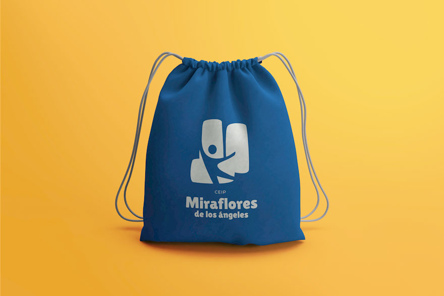
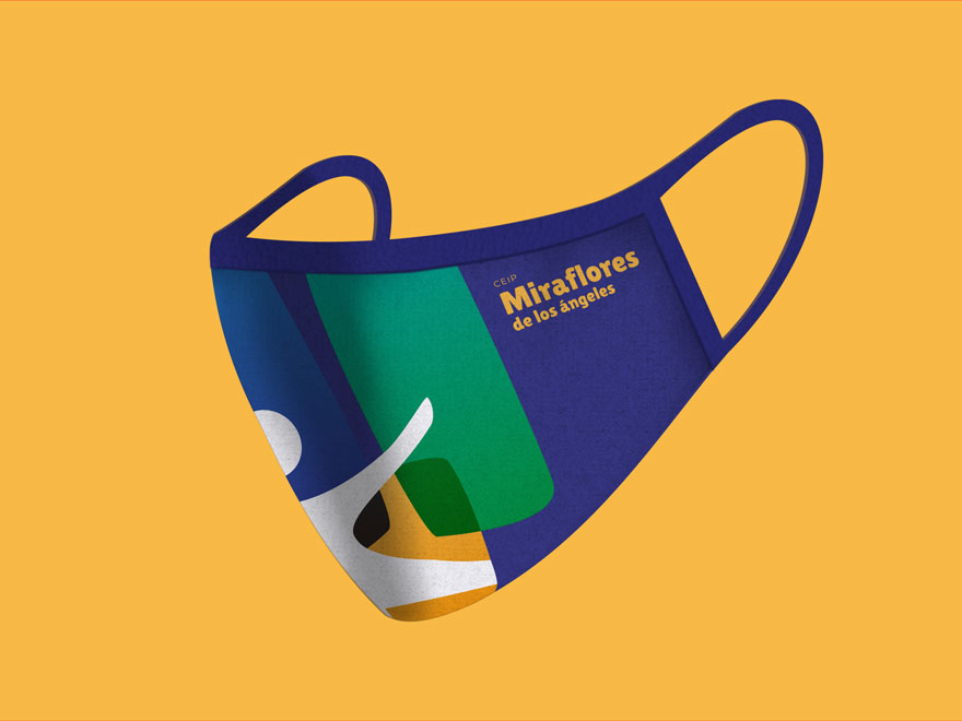
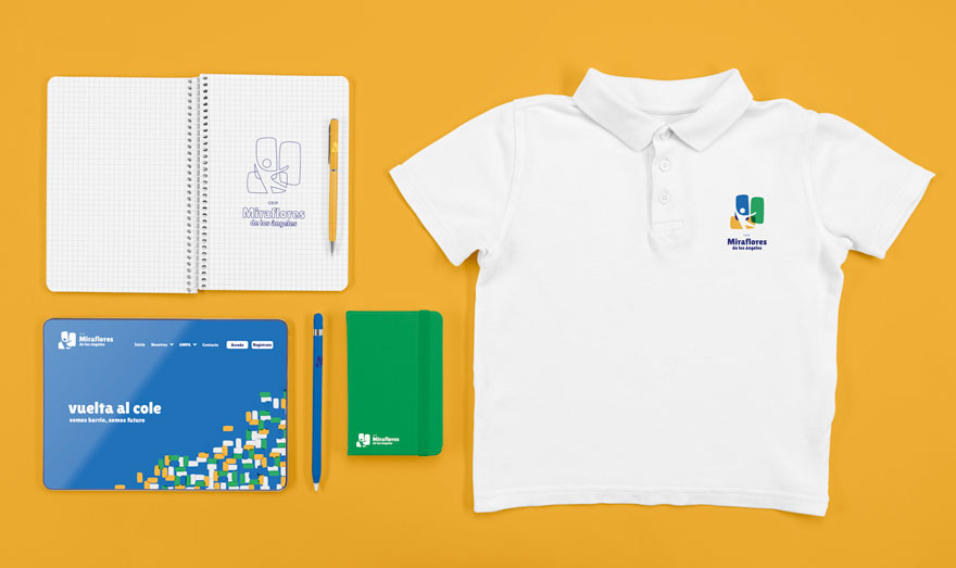
The morphology and colour of the logo brings with it the inevitable generation of a whole graphic universe. Thanks mainly to the variety of colours and graphic element “stained glass / brick”.
The game of compositions and colour is transferred to each communicative element related to the school. From corporate stationary, school supplies, posters, signage, etc.
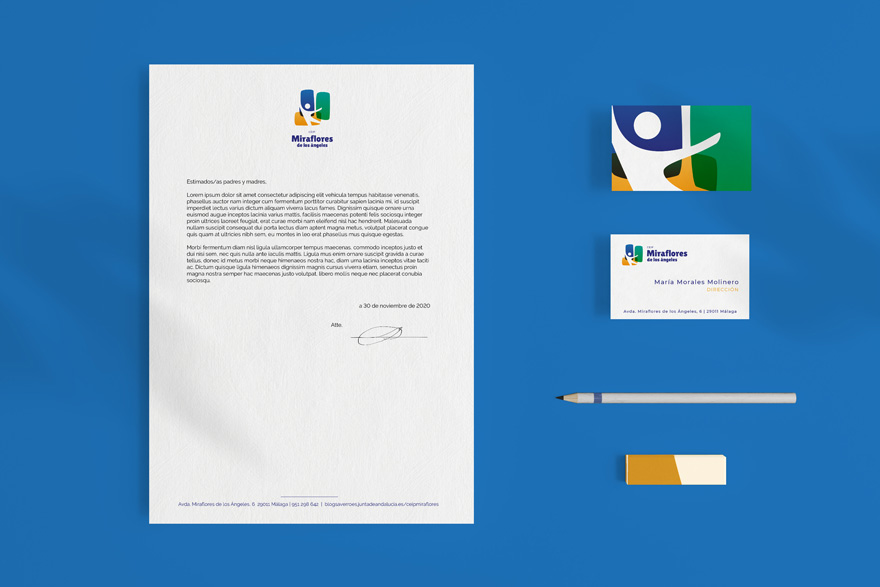
As a result, a lively corporate design, capable of transmitting movement and revaluing the image of the school.
As a culmination of the project we produced a video that, in addition to telling the different actions of the project, will help the school to communicate the changes to the entire educational community.
You can see the other part of this space branding project in the following link:
Interior design of the Miraflores School
If you are interested in discovering other graphic design projects and how they can be applied to space design (space branding), we encourage you to continue browsing our website.
