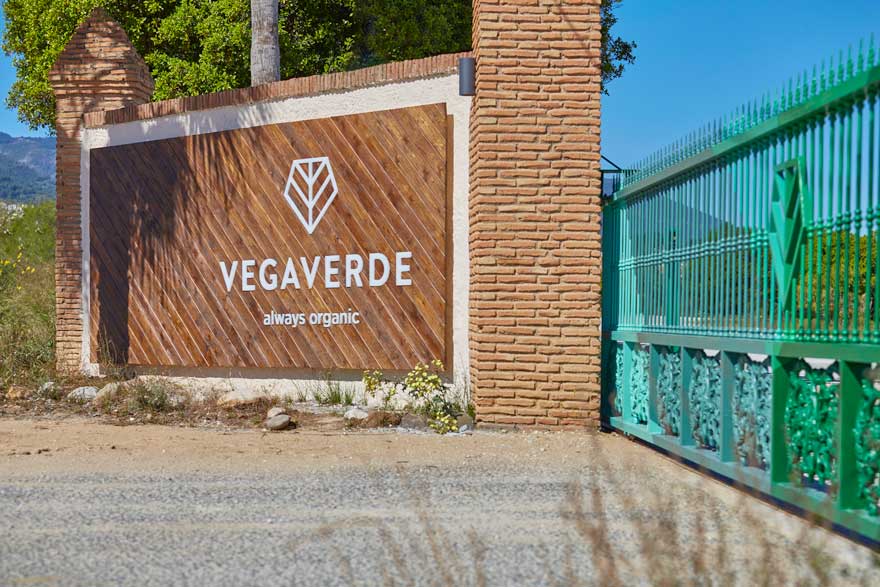
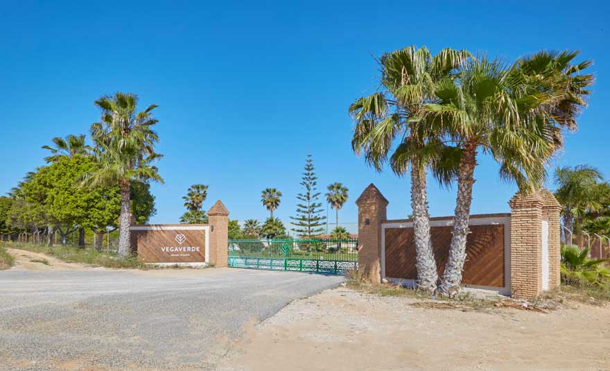
Space branding for companies begins with the first image we have of them. For this reason, the Vegaverde company has trusted Filbak for the design of the access to its new facilities in Malaga.
Vegaverde is a leading company in Spain in the production, packaging and marketing of top quality Bio citrus. Their growth and trajectory has led them to need to expand their facilities.
Consequently, they have created a new 20,000m² warehouse and packing center, with good connection and visibility from the road.
space branding for companies: from the inside out
As designers and architects specializing in space branding for companies, the priority has been to create a coherent brand universe when moving from paper to space.
To do this, it began with a deep analysis of the brand. A recently renewed new image inspired by the entire environment that surrounds the company and its products. Where elements such as the lines that form the fields when crossing, the mountains or the trunks of the trees became a source of inspiration.
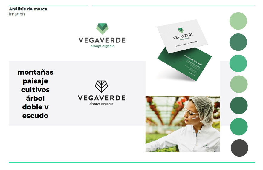
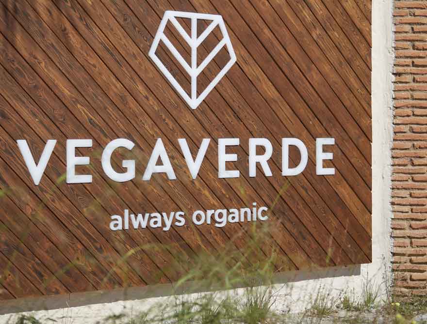
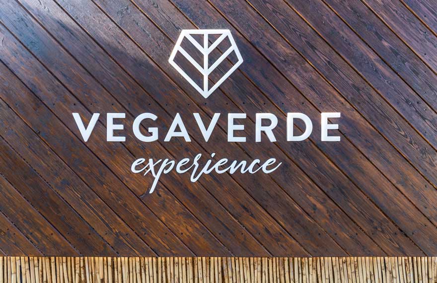
As a result, VegaVerde’s double “V” along with the lines of the inspiring elements shape the new logo design.
For its part, the green corporate color links the brand with nature, ecology and the diversity of organic products.
from the two-dimensional brand to three-dimensional space
The first challenge of the project focuses on access to the facilities, since it is the first image that they project to the outside.
The objective of space branding is to ensure that the values and identity of the brand are present in all elements of the company. It begins with the graphic image, but this must be transferred to the space, the materials, the environments …
Ultimately, the goal is to offer the user a complete brand experience.
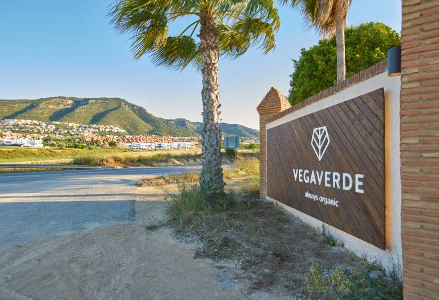
This experience begins from the entrance itself, offering a visual impact not only for the people who are going to access the facilities, but for the hundreds of drivers who pass through its door every day.
The image of the company becomes part of the general imagination of the people who circulate on that road. Even becoming a point of reference for its differentiating character and memorable experience.
corporate materials and textures that make a brand
The corporate identity of a company integrates both graphic and formal elements (colors, fonts, shapes …), as well as intangible concepts (values, mission, feelings …). The role of space branding for companies is to make a perfect cocktail with each of these ingredients and bring it to the physical plane. There it acquires color, lighting, texture and formal dimension.
Vegaverde is a brand committed to people and the environment, with the aim that everyone can access quality organic food.
This sensitivity for sustainability, ecology and responsibility were key in the design, translating them into the following corporate materials and textures:
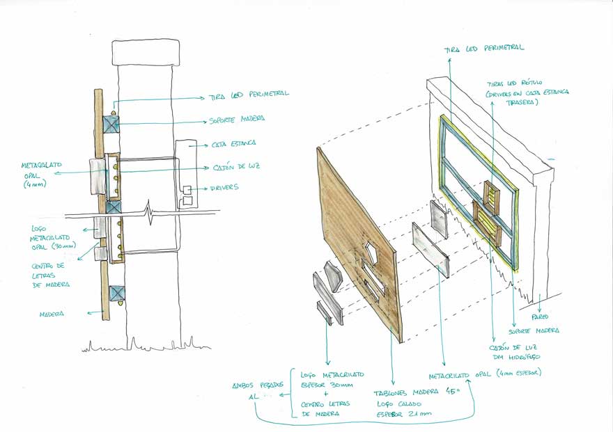
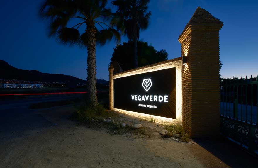
- Wood, providing warmth and connecting with the agricultural sector to which it belongs.
- Green tones obtained from its graphic identity..
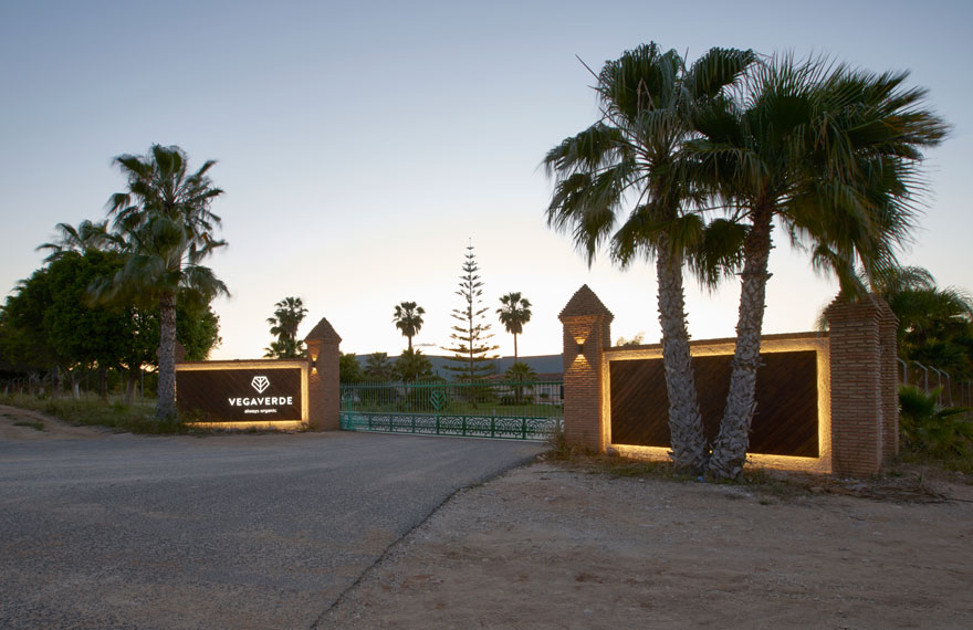
- Sign and lighting, which offer that technological, innovative and quality air that represents them. In addition, to give them visibility.
The proposal integrates the resource of the inclination angle with which the Vegaverde logo is formed. This one refers to the initial “V” in a generalized way.
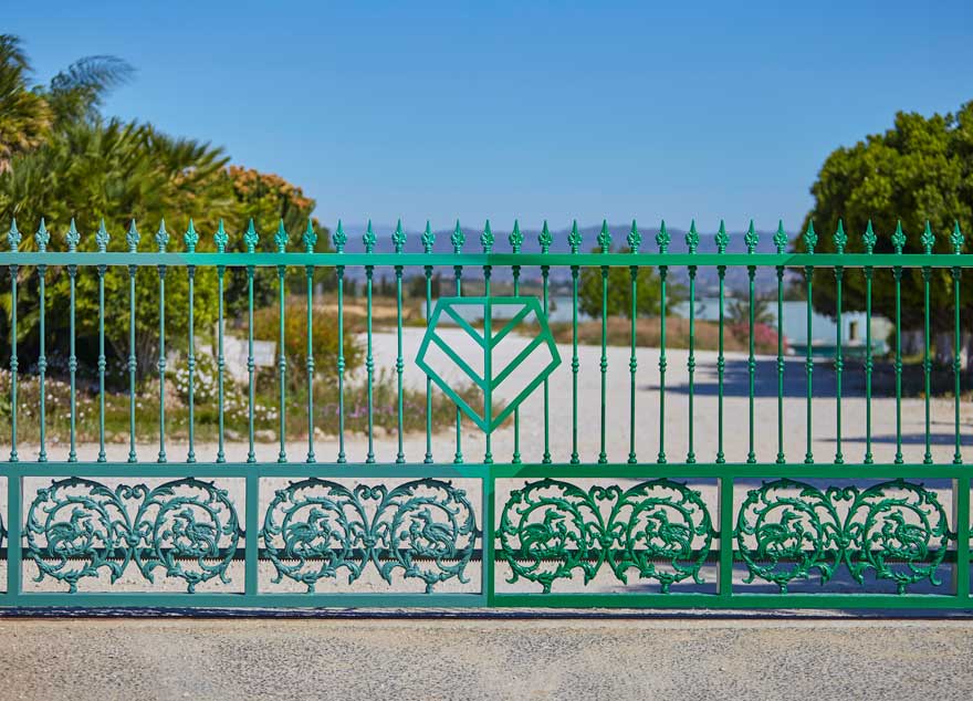
It can be seen through the integration of the logo on the gate; in the angle of the color sections of the painting of the same; at the angle of the wooden slats that form the side panels; and even in the beams of light that the chosen luminaires project.
As a result, Vegaverde has a simple and forceful access design to its facilities. A proposal that represents and identifies it, positioning it as a reference.
Space branding for companies is a key resource in their positioning, recognition and development. An engine that can propel them to their level of excellence or accompany them as they deserve if they have already acquired it.
space branding in response to different needs
Faced with the need to condition another of its facilities, Vegaverde turns to us again to extend the performance. In this case, it will be “Vegaverde Experience”, a reception point for visitors to live a 360º brand experience.
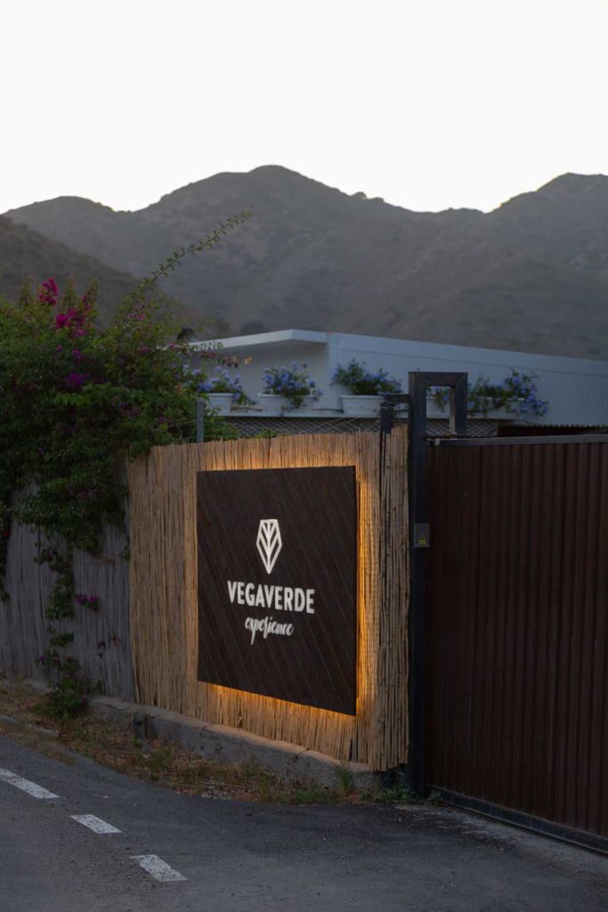
Conditions similar to the first intervention led to a similar design. The elegant nuance of the illuminated logo on a wooden base and a backlight that this time emphasizes the hurdle as a natural and organic material.
Through this second intervention it is shown that a good space branding design is capable of solving the different needs of the brand.