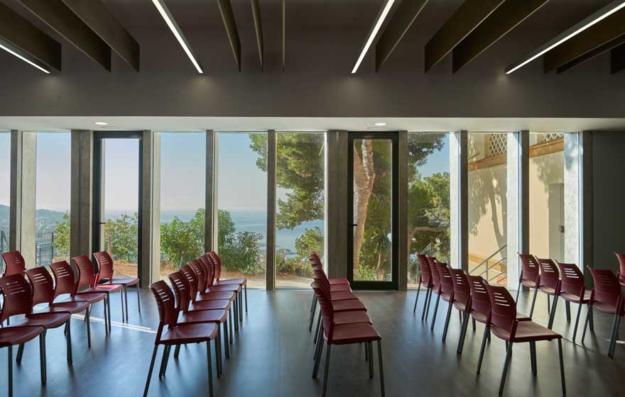
A school renovation across the paradox of integrating the exterior as part of the interior design is the key resource of this project located in a unique enclave.
initial conditions
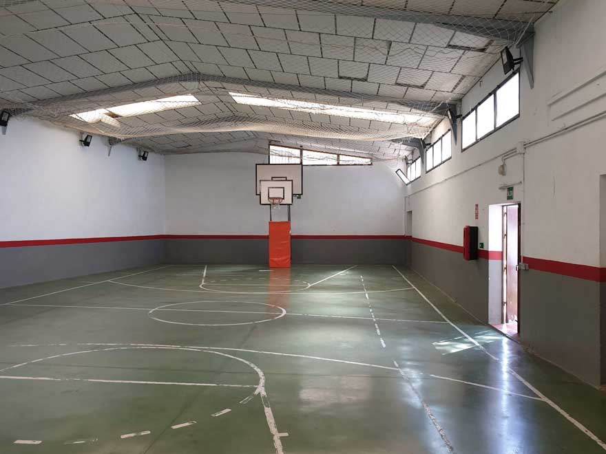
This reform carried out in the Sagrado Corazón school in Malaga, aims to renovate an old pavilion for sports use.
The purpose of the renovation is to give the school a multipurpose space. A space that can function as an assembly hall, covered recreation room or venue for events, both internal and external.
It was a dilapidated space, detached from its surroundings and gloomy. But with great potential due to its location and orientation.
school renovation towards the environment
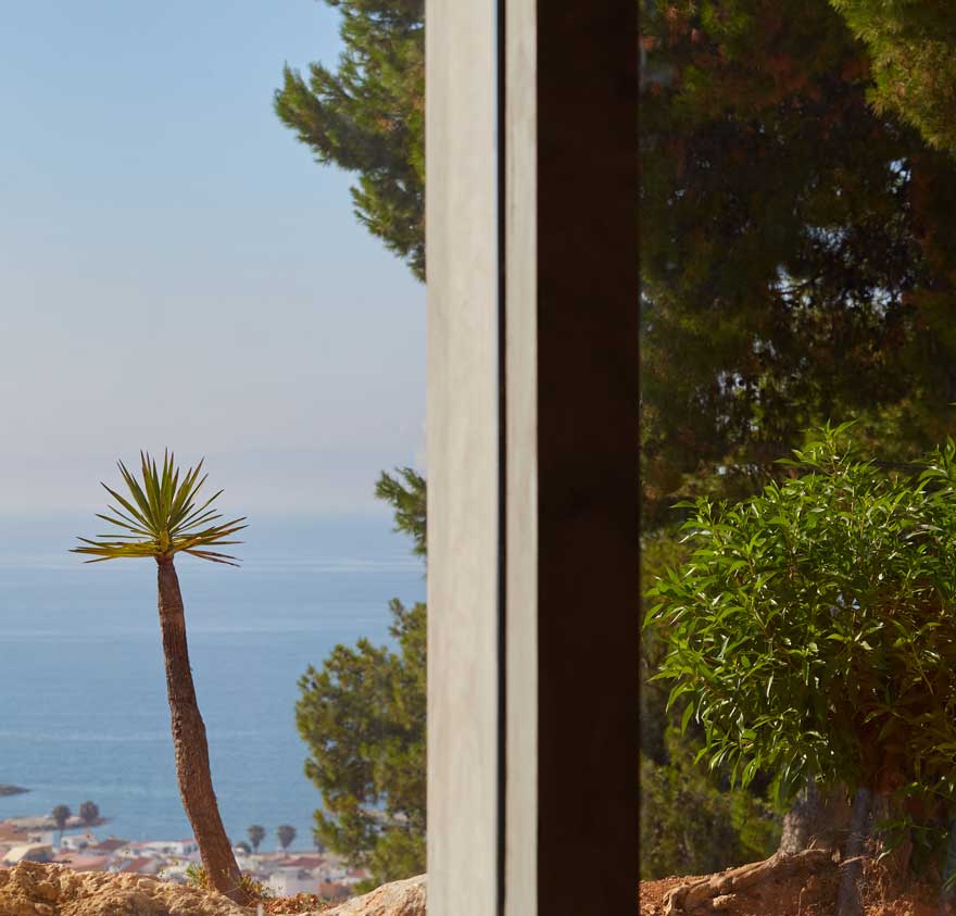
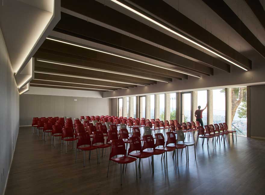
The privileged views that can be seen from the location of the pavilion become from the beginning the main motivation of the project. The first and most important decision is the opening of the south-east enclosure. Integrating as protagonists transparency, the plant environment and the sea.
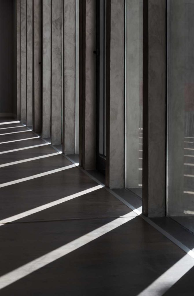
The opening gives rise to the integration of vertical ribs. These generate rhythm in a play of light and shadow. Through them and the progressive movement of their morning shadows, the user becomes aware of the passage of time, thus favoring their circadian rhythm.
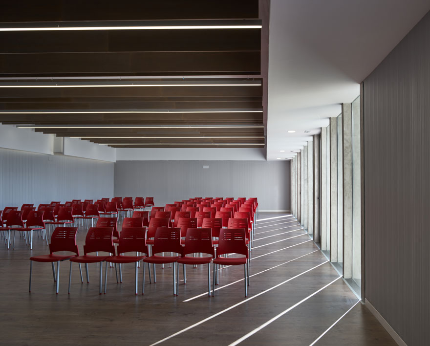
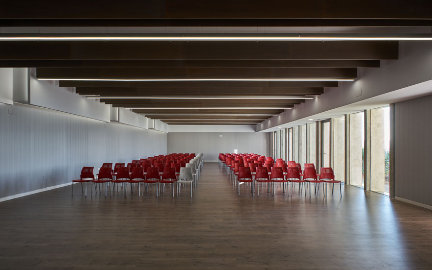
The architecture is characterized by its orthogonality and spaciousness. But unlike the previous state, the amplitude comes from the hand of a ceiling height that respects the human scale and a correct use of light.
This renovation in the school also implies improvements in terms of practical matters. One of them is the provision of space for accessibility.
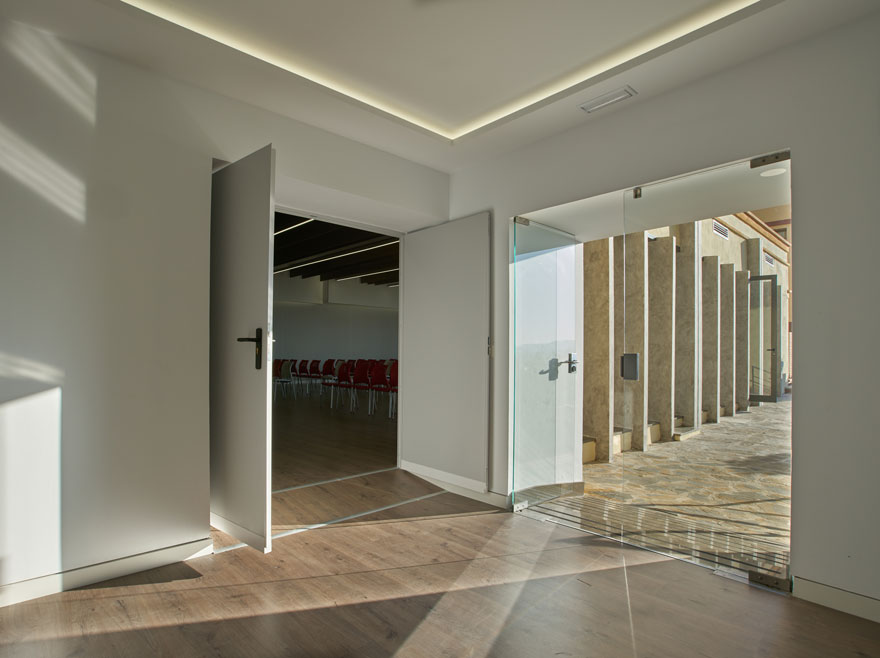
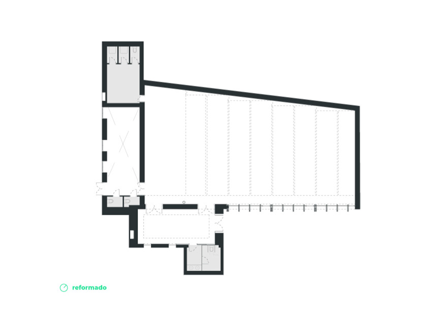
In addition, the approach of its internal structure allows the subdivision of the space into five parts. Each of them will be able to function independently, since they are provided with individualized installations.
interior design and environments
For the interior design, neutral textures and tones are chosen, creating a canvas that contrasts with the saturated colors of the exterior. As well as the luminosity and the use of wood provide the necessary warmth in such an open space. The use of indirect light adds depth to the different environments.
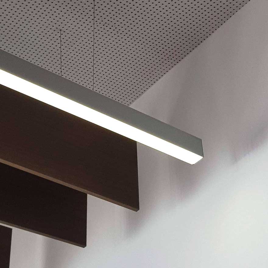
Getting good acoustics is paramount. Materials such as vinyl wallcovering, wooden baffles and perforated ceiling tiles are used to meet this need.
Finally, lighting acquires a fundamental role in the generation of interior design. In addition to meeting the lighting needs of the space, it adds depth and reinforces the orthogonal character of the project.
To see another of our school projects, visit this link. To see other space branding projects, visit this one.
