Saber.tech is a leading software development company that needs a design, innovative and attractive stand for the international event JOTB’23 (Job On The Beach) for the first time held in Malaga. This is a Big Data event for developers held at the FYCMA (Palacio de Ferias y Congresos de Málaga) between the 10th and 12th of May 2023.
The stand aims to raise awareness of the Saber.tech name and attract new talent by conveying the values of its brand.
This design stand must show the brand identity and give continuity to the environment designed for its new offices designed by Filbak in the centre of Malaga.
design concept
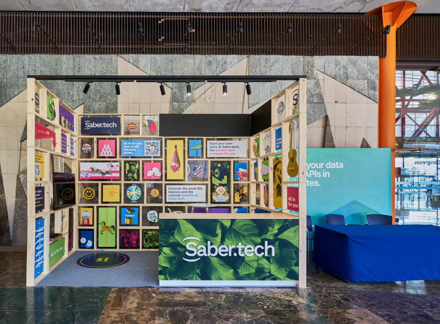
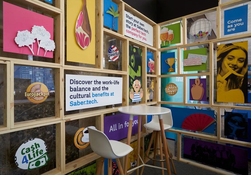
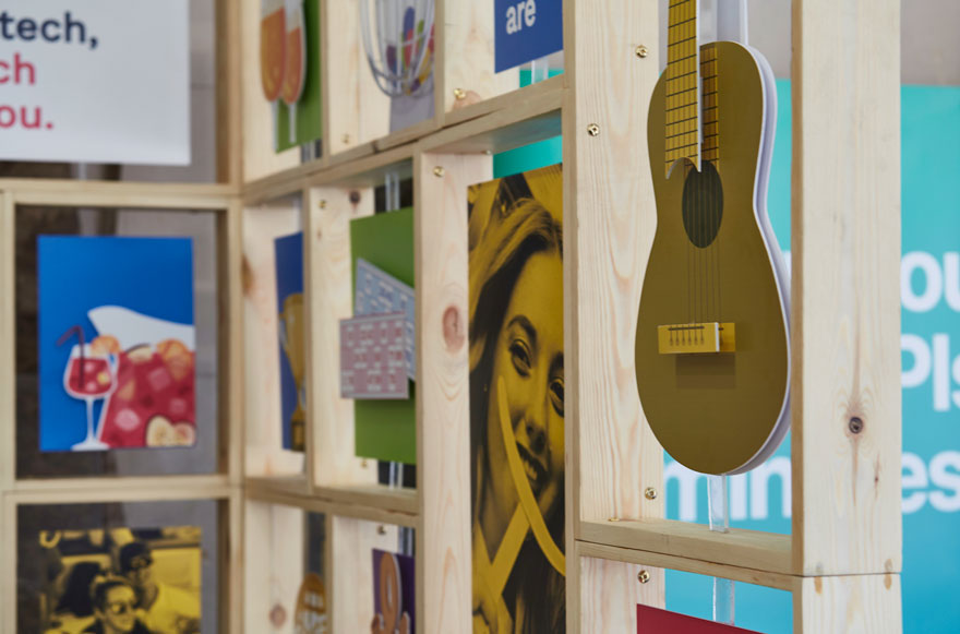
The design concept is that of the cabinet of curiosities. Known as the “chamber of rarities”, it is an ancient exhibition concept in which rare, exotic and curious objects are displayed. It is considered the forerunner of the museum.
This line of action makes the stand unique and different. The aim is to capture the attention of a public that stops to look in detail at the elements individually and not as a whole.
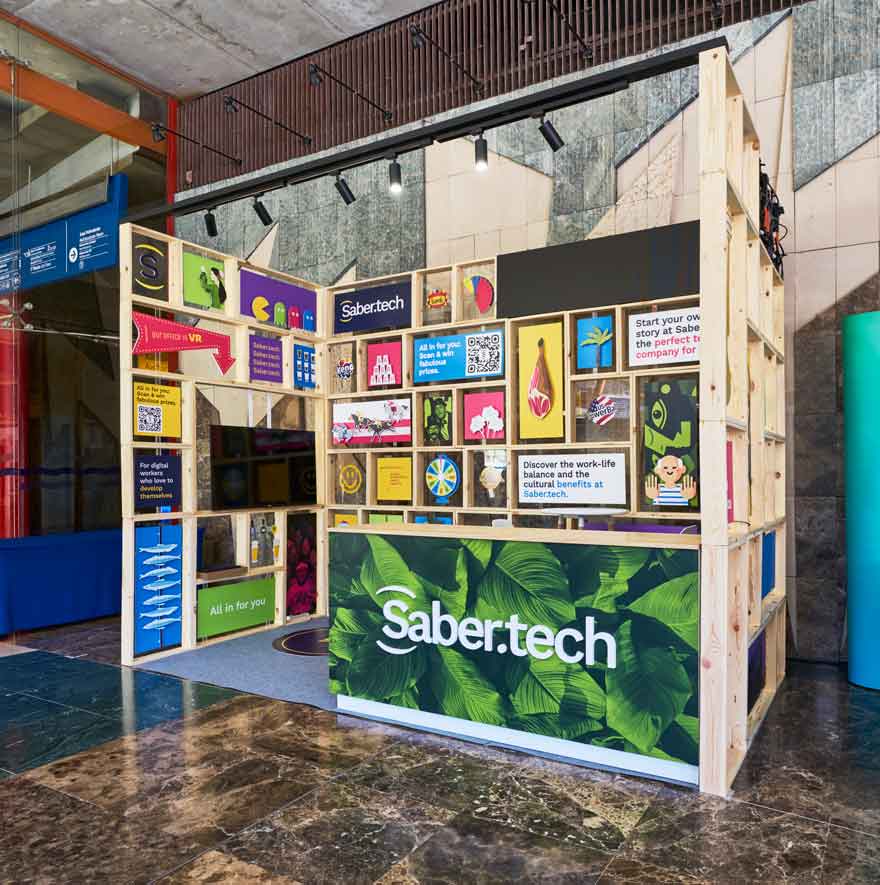
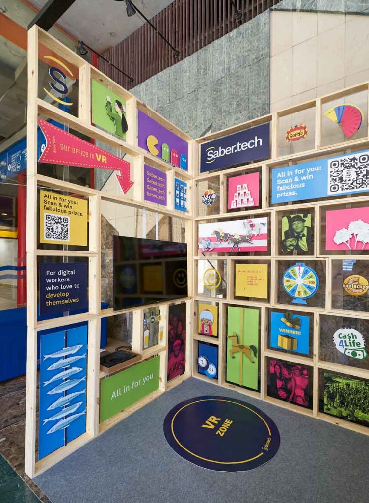
They are all different from each other and seek to convey the fresh, youthful and cheerful essence of the company. But as was already done in their office, maintaining the link with the tradition and culture of Malaga. Elements ranging from themes such as the aesthetics of the “tapas bar” in their offices, through the city of Malaga to the world of technology, betting and lotteries.
reusable design stand
To the objectives proposed by Saber.tech, it was decided to add a new challenge to the project: to create a sustainable and reusable stand.
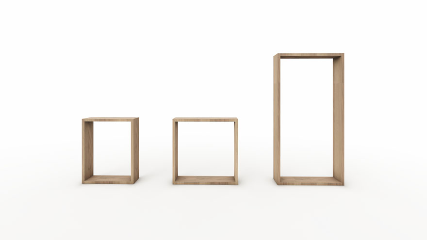
The idea is to design a system that can be reused in the future, so it is necessary to generate a sustainable and adaptable design that allows a second life after the fair.
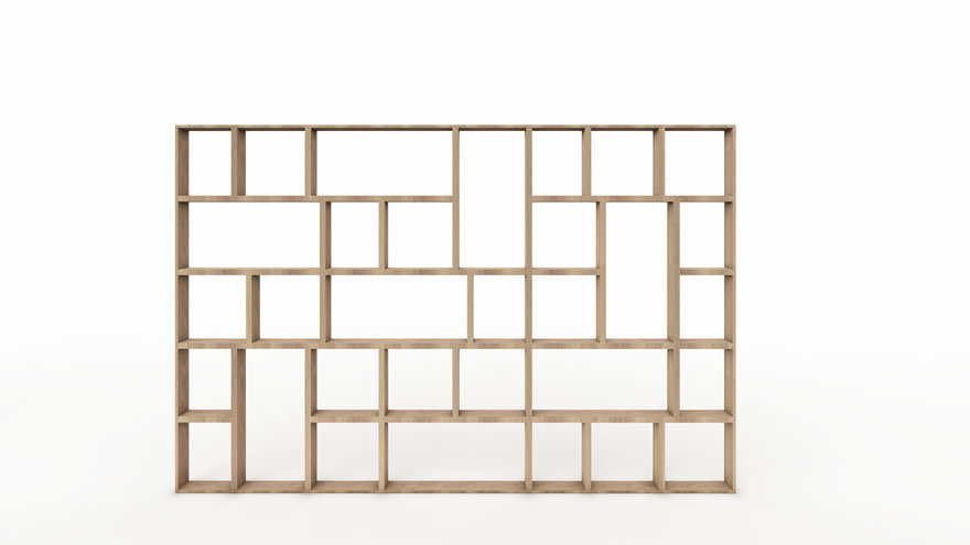
For this purpose, a system of wooden modules that can be joined together in different ways has been devised, providing great flexibility in the configuration of the stand. In this way, the stand is reusable for more trade fairs or events.
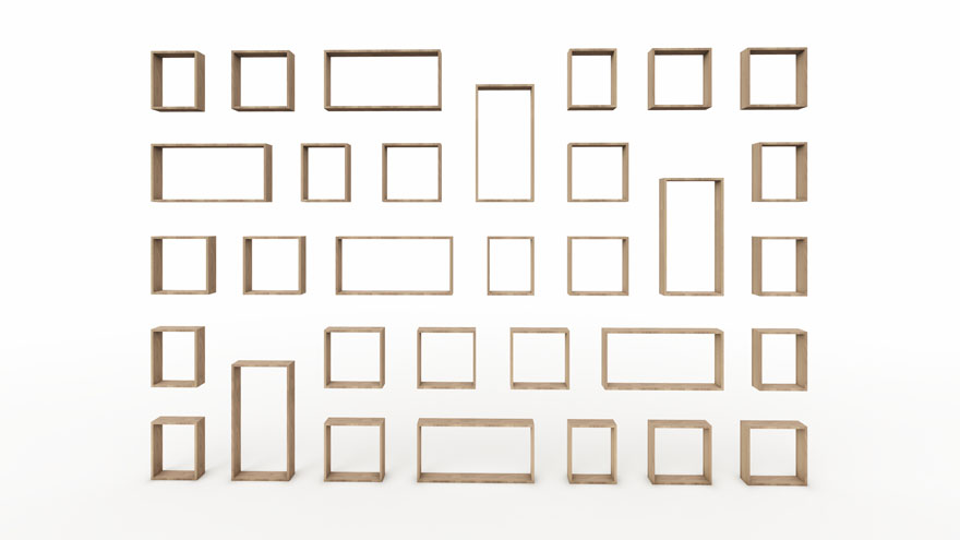
Once the fair is over, it can also be reused by separating each module as part of the decoration for the Saber.tech offices. This provides added value and reduces the environmental impact.
In addition, the walls of the Saber.tech offices become their own storage space where the stand elements can be stored between events.
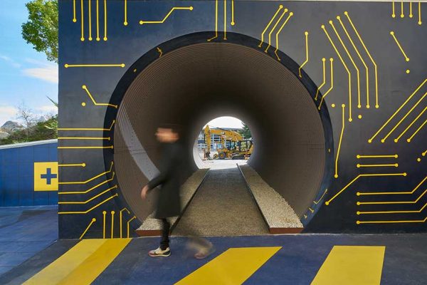
breaking the boundaries of the physical
Despite the handcrafted look of the wood and the colourful illustrations, the design of the stand is intimately linked to the digital. It seeks to overcome the barriers of the physical, making room for virtual reality. It becomes a gateway for visitors to explore a virtual tour of the new office in the centre of Malaga.
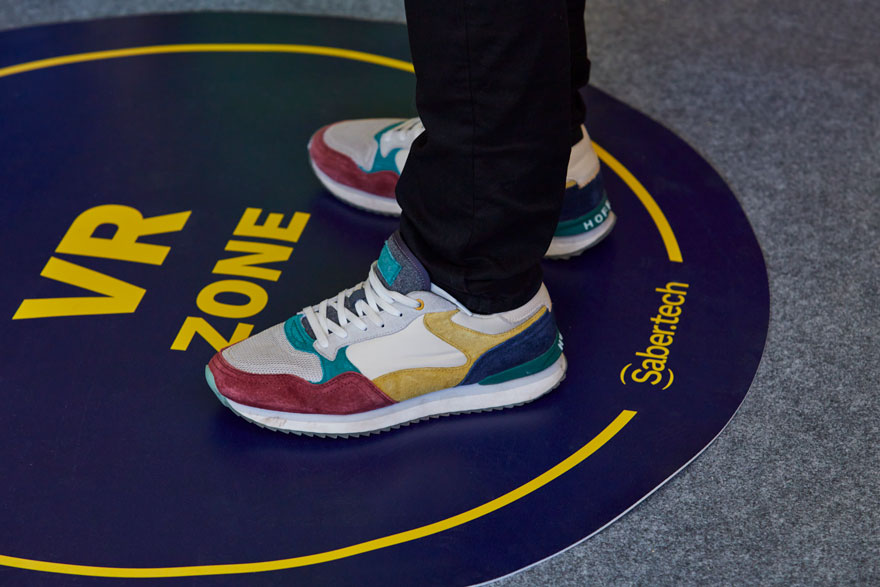
Large LED screens are also set up to show the brand values and promote the raffles that take place during the fair.
signage for design stand
As for the graphics, it was decided to follow a line of illustration in colour, without contours, with an intermediate level of detail that maintains its character and depth, without compromising the readability due to the scale of the element and the distance at which it is observed.
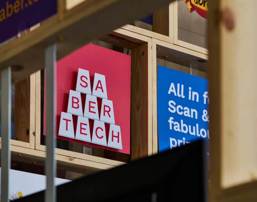
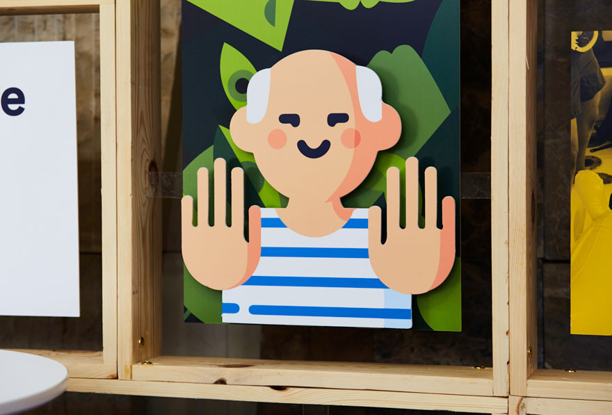
These illustrations are complemented by small signs with phrases or even photographs of the team.
All of this is always based on the corporate colours of your brand. Complemented with neutral colours, they create a heterogeneous ensemble that is perceived as an eye-catching unit by visitors.
This generates a unique experience, which translates into greater attention and retention of the brand. In turn, creating an open and functional space that allows interaction and direct contact between visitors, future employees and the Saber.tech team.
In short, the design of the Saber.tech stand for the JOTB’23 fair is a commitment to innovation, creativity and space branding. An opportunity to showcase the company’s identity and values in a privileged environment and at a privileged time for technology companies.