SALG decides to rethink its corporate image of the company in search of its next goal: to be a benchmark in international trade. It is a port and maritime logistics company founded in 1880. With a history of more than 140 years, its activity is based on loading and unloading, consignment of ships, customs agency, transport operator and forwarding containers.
Due to its efficient, committed and close work, it has become a benchmark in its area: the ports of Almería, Motril and Carboneras.
They had a corporate image with which they did not feel identified and that did not manage to convey the concepts and sensations they were looking for towards their clients:
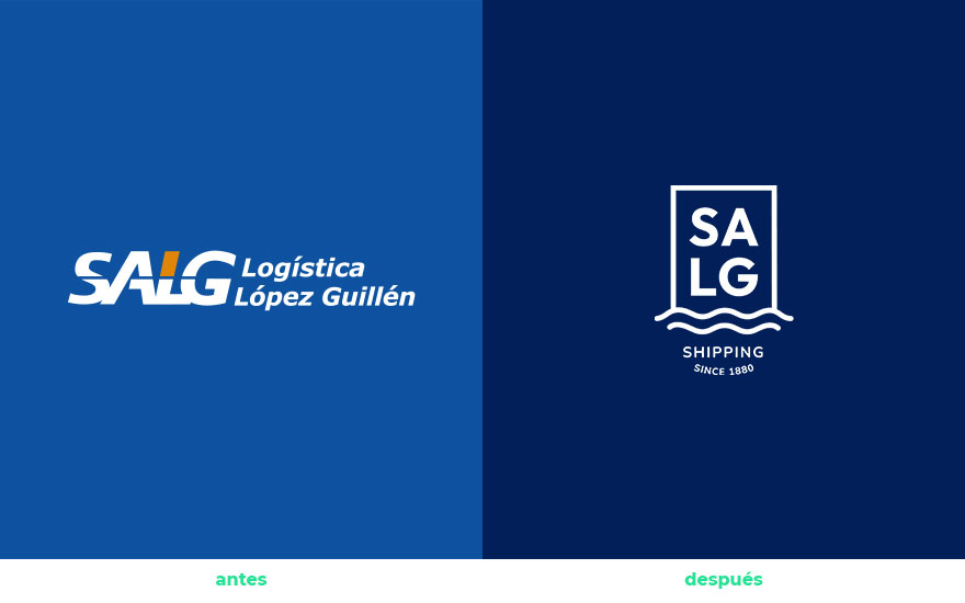
the brand
There are two main concepts for which the company wants to stand out:
- Professionalism: be perceived as an expert in international trade, guaranteeing comprehensive responses and the best results for port and maritime logistics needs.
- Confidence: transmit it so that customers feel calm that they are leaving their merchandise in the best hands
A brand personality that is conveyed in its slogan:
Expertos en el mar, con los pies en la tierra (Experts in the sea, with their feet on the ground)
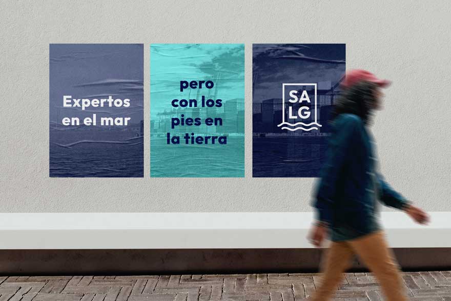
corporate image of the company: the logo
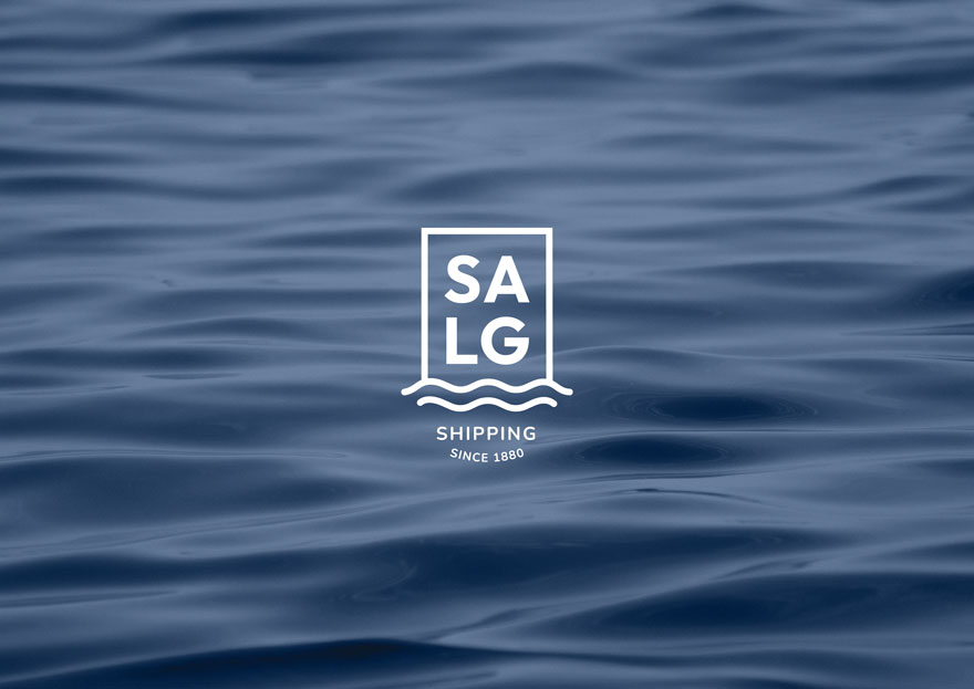
Since the company is linked to the maritime sector, the sea has been chosen as a concept. A blue and calm sea that transmits us tranquility, serenity and confidence.
The “coming to land” of a ship is transferred to the brand, which appropriates this concept as a synonym of solidity and firmness. In addition, it is also played with the fact that the “heavy” element has parallelism with the merchandise (that which is transported by sea).
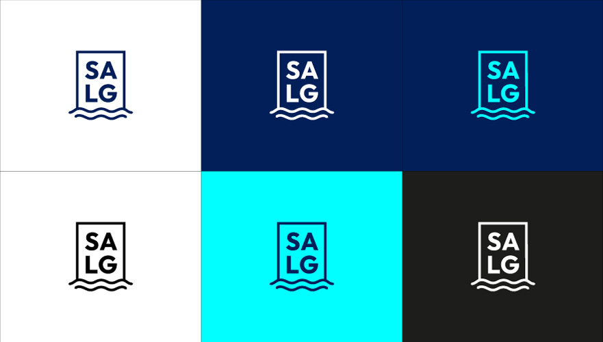
The gesture of encapsulating the brand inside a “container” and the typography appearing stacked, evokes how the merchandise would be on a ship. But in addition, it works as if it were the firm port to which the ship arrives through the sea.
As a useful resource for the brand, versions of the main logo are created. We seek that the brand can adapt to reductions, spaces with horizontal proportions and the favicon, studying the minimum reproduction size of each version.
color palette and fonts
Both the colors and the fonts seek to complement the logo in its most current, professional and reliable aspect.
The brand is complemented by a modern and vibrant palette. Transmitting confidence thanks to dark blue, modernity thanks to electric blue and dynamism thanks to orange.
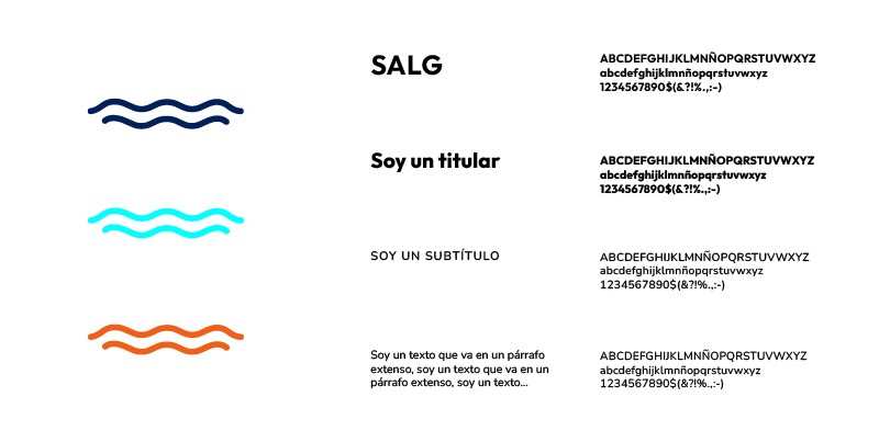
The typography of the logo gives the brand presence and modernity. While for the body of the text, a more rounded and easy-to-read font is chosen, which is closer and more friendly.
corporate image of the company: applications
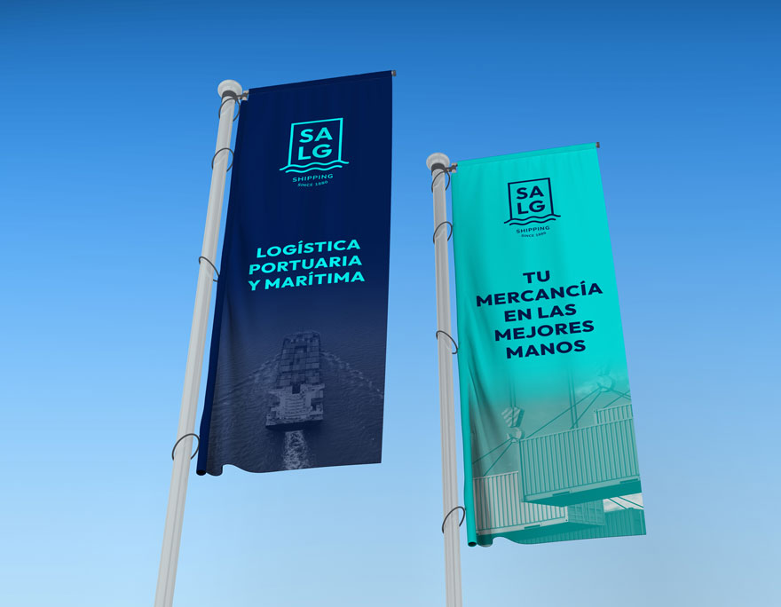
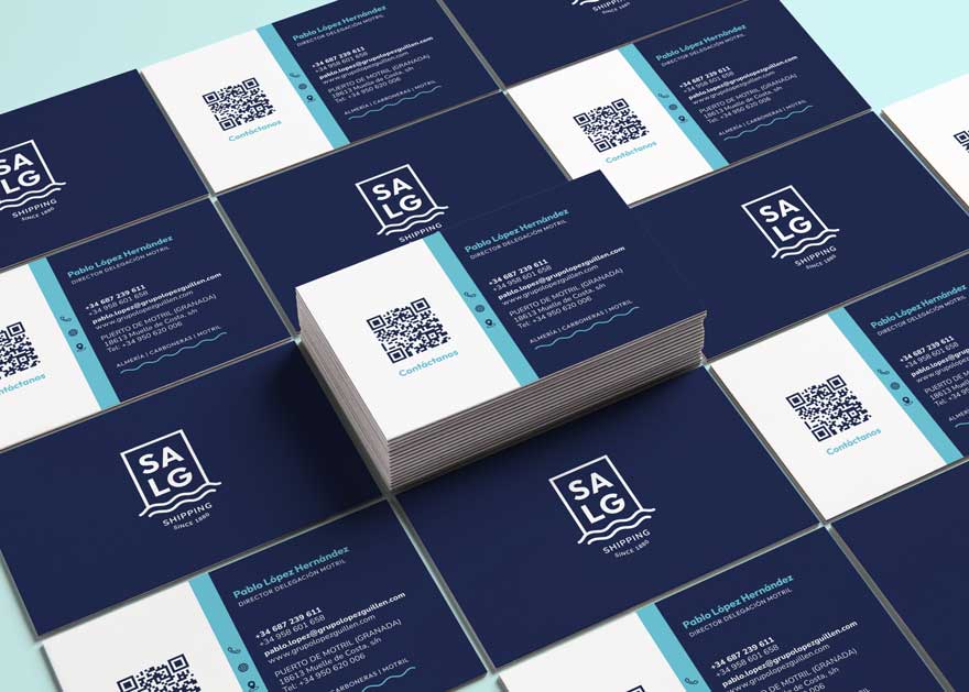
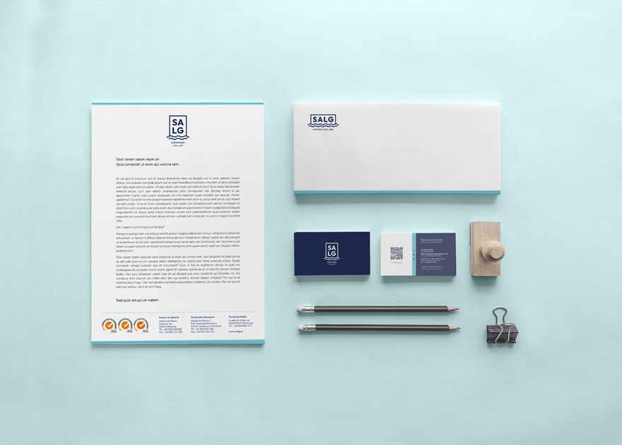
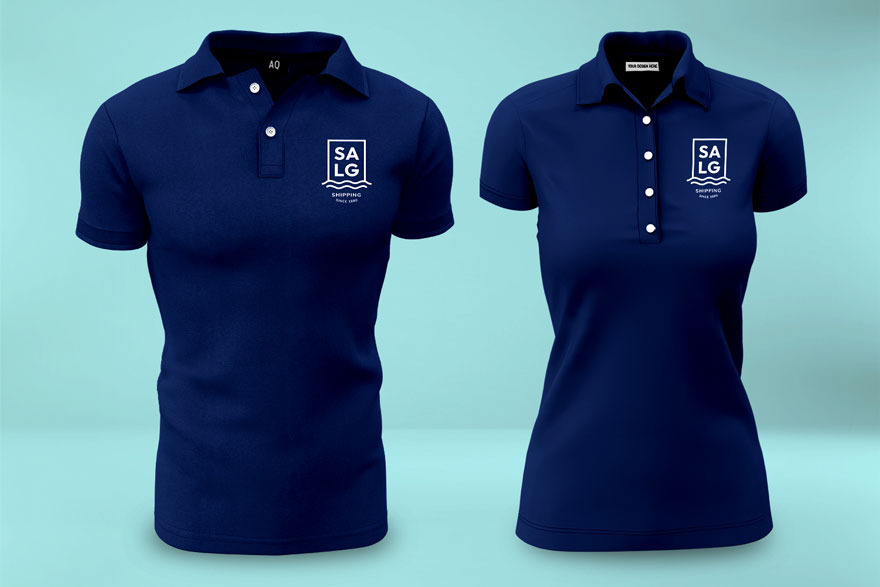
The visual identity of a brand cannot be understood without paying attention to how it is implemented in the different applications. In this case, it is proposed to continue with the concept of serenity, modernity, simplicity… The result is a recognizable brand due to the simplicity of its elements and applications, as well as its chromatic character.
If you found this project interesting, you can see other similar ones here
