The project consists of the design of the new corporate identity that began as a standard carpentry.
corporate identity and business strategy
With the experience and the passage of the years, the carpenter becomes an advisor capable of covering complete projects of renovation of specialized rooms. Specifically, inside homes, such as kitchens, bathrooms or closets.
This differentiation means a redirection of the business and, therefore, calls for a redesign of the logo and the brand.
The new way forward is committed to quality and specialization in design carpentry like a distinctive compared to the competition. Factors that are taken into account in the restyling of the brand.
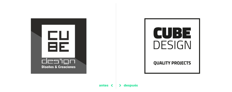
Considering that the original brand had been consolidated among the clients, a conceptualization work is carried out. It is proposed to give continuity to its corporate identity without detriment to the necessary changes.
a clean, strong and refined brand
These modifications come from the hand of improving the cleanliness, the composition, the legibility of the typography, the friendliness of the graphics and the reduction of the contrast of sizes.
a new concept where “design” prevails
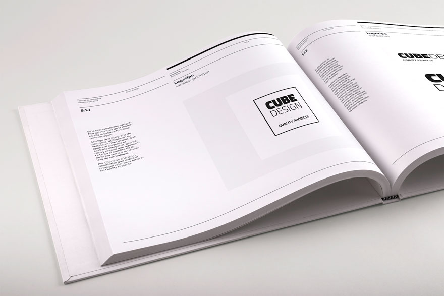
On the other hand, including the word “design” as part of the composition of the logo speaks of the importance it takes on in the new business direction.
In addition, by unifying the typography in both the logo and the tagline, a more cohesive brand is achieved.
In the main logo, this tagline takes on special importance because it is the element that defines the square so closely linked to the brand.
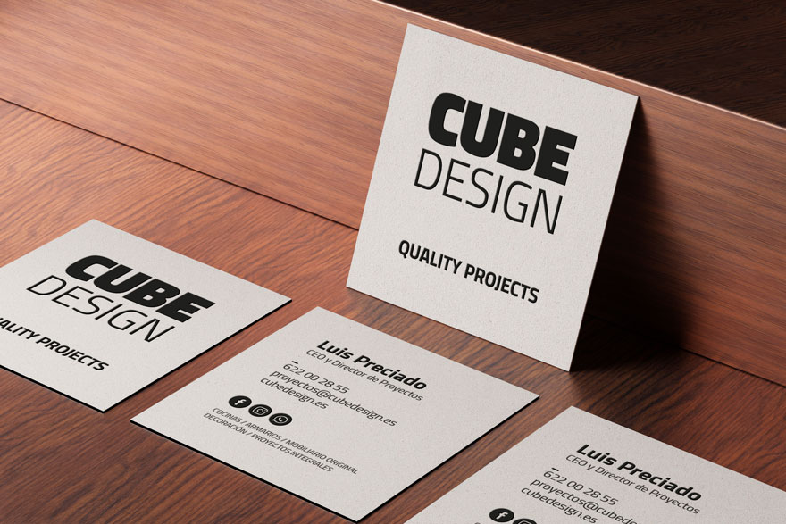
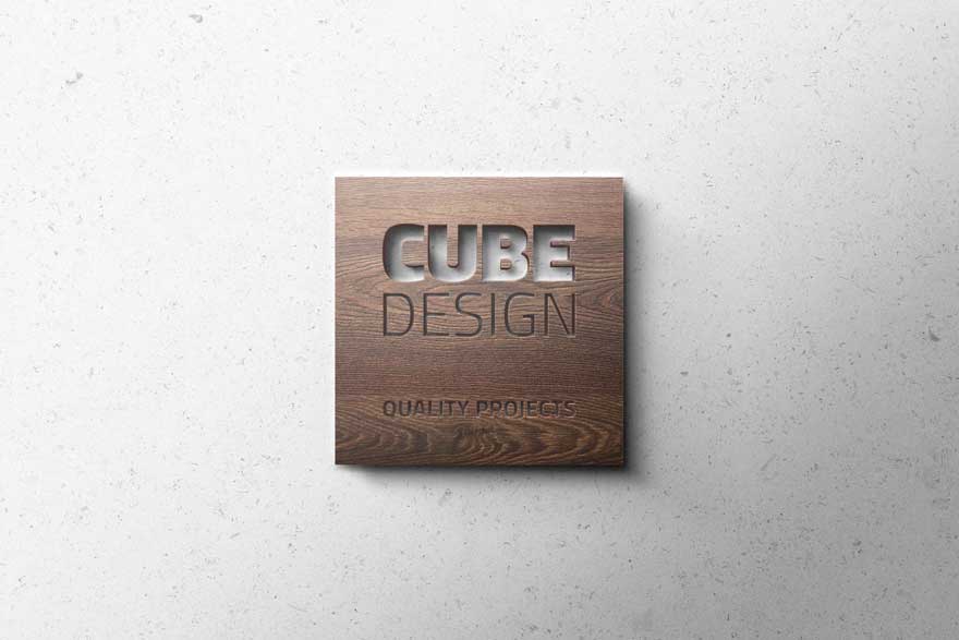
As a result, a new current logo but faithful to the corporate identity of Cube Design. An identity based on neutral colours and simple lines.
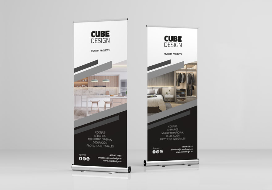
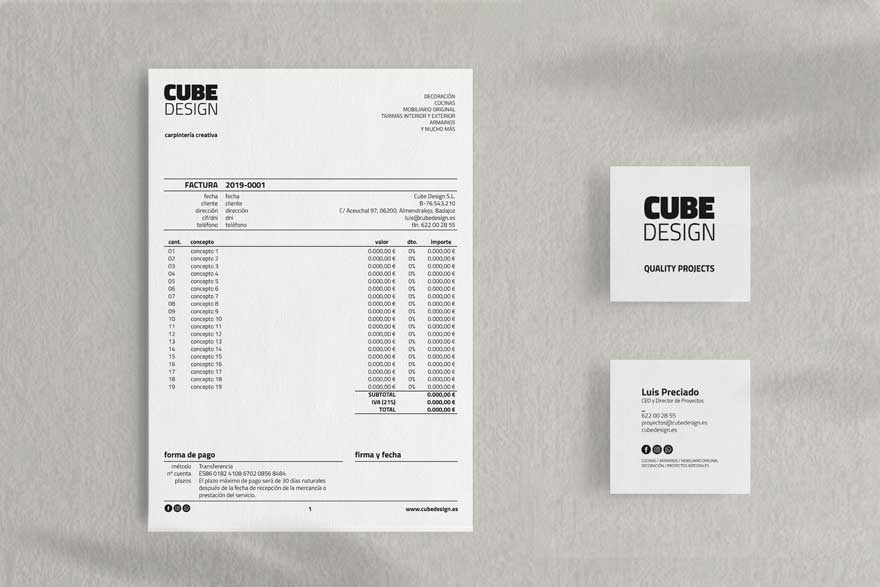
The new brand universe is transferred to different graphic design applications, such as business cards, quote sheets, invoices, or roll-ups. Simplicity without losing forcefulness and high contrast as standard bearers to lead the commitment to design and specialization in woodworking.
