Casa Kiki decides to renew its corporate image, presenting a new challenge: implementing this brand image in the interior design of its new store in Málaga, and making it a turning point for future openings.
knowing the customer
Casa Kiki is a family-owned bakery from Málaga with over 30 years of experience in confectionery and bakery. They have several workshops and sales points distributed throughout the province, and their products are homemade and scalable in different sizes.
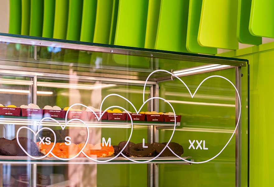
A few years ago, they revolutionized the palm tree pastry market by creating an XXL version, designed to be shared with everyone. Besides their famous product, which they cover or fill with anything imaginable, they also produce another typical Málaga sweet, the “loca,” in large format. But Casa Kiki doesn’t just make palm trees; they also offer a wide variety of products that you’ve probably seen personalized at any event – they have no limits!

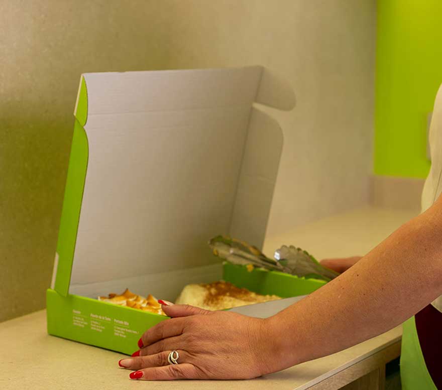
Thanks to a detailed market study in collaboration with Anguis, they gained a deep understanding of Casa Kiki’s most frequent customers, their needs, and how to make their shopping experience more enjoyable while simplifying the daily work of the employees.
new store model
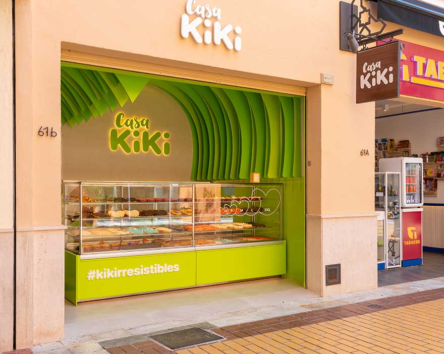
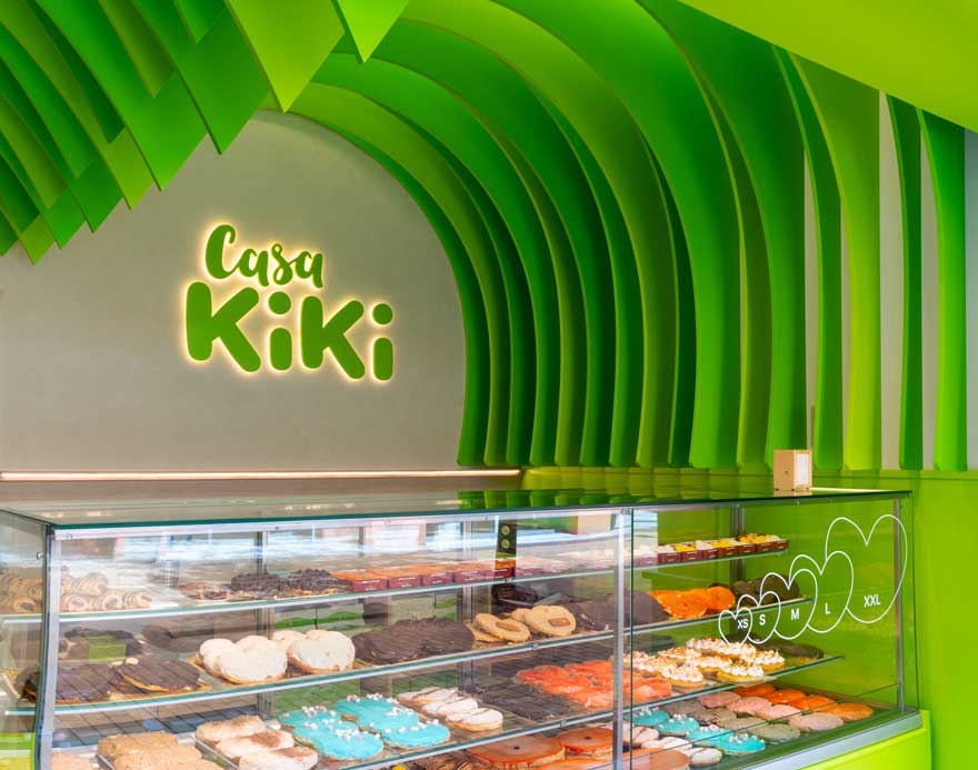
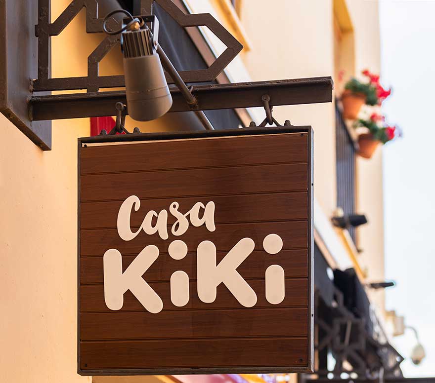
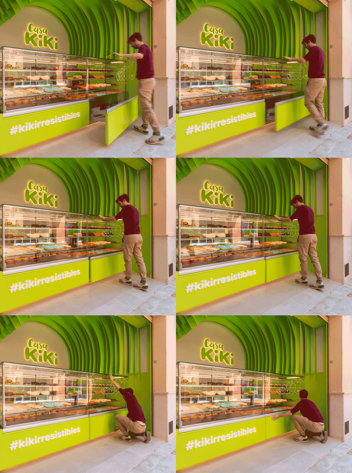
The first flagship Casa Kiki store opens in the Plaza Mayor Shopping Center in Málaga, featuring a new brand image, new corporate colors, logos, and materials.
This new concept had to showcase the brand’s fundamental pillars: the palm tree pastry, craftsmanship, and fun. Additionally, as a flagship store, it was important that it be an eye-catching space from every perspective.
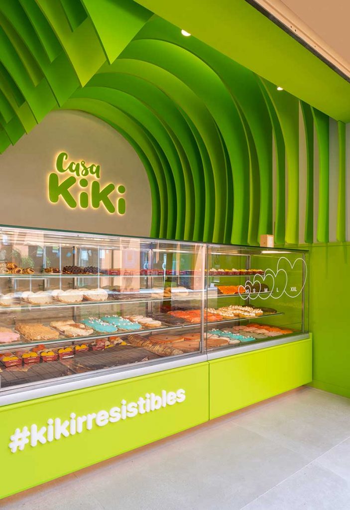
This new sales point is strategic; Casa Kiki Plaza Mayor will connect with a much broader audience from all parts of the world due to its proximity to the airport, moving away from the traditional neighborhood bakery to be established as an express sales point, much like a kiosk.
Casa Kiki Design Concept
Casa Kiki is synonymous with sharing, gathering, and fun. A product that maintains craftsmanship at a time when everything is sold industrially. Based on these values, puff pastry was chosen as the main element, symbolizing their craftsmanship, creating “slats” on the ceiling and walls that mimic each layer of this raw material, curving to resemble one of their great achievements: the palm tree pastry.
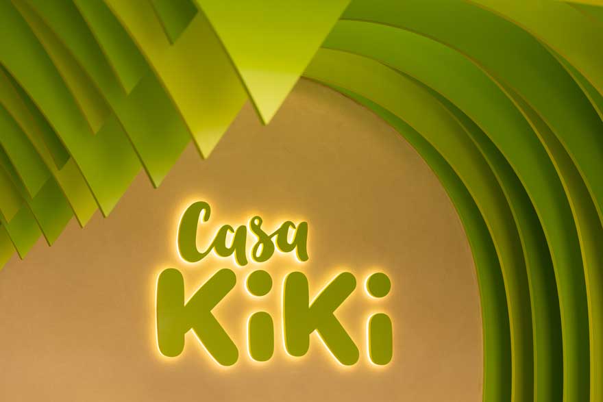
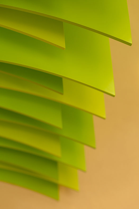
The design also plays with the combination of three corporate green tones of the brand and indirect lighting, giving great depth to the small space.
Regarding the materials used, lacquered wood is used to create the palm tree slats, a clay mortar that conveys craftsmanship through its application with a spatula, and warm-colored flooring that contrasts with the liveliness of the corporate green.
As a result, a small but striking and memorable store that attracts both local customers and tourists, renewing its image to reach a broader audience while recalling its fundamental values, which remain present in every process of the brand, from manufacturing to customer service.
In summary, a retail project that makes a significant leap from the traditional classic bakery concept to a flagship store that marks a before and after in the design of its future stores, giving it a fresh, attractive, and contemporary look.
If you liked this, you can check out other projects of ours here.
