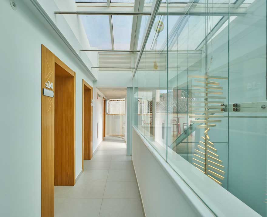
Promálaga has once again entrusted us with the design of its new corporate office in the historic centre of Malaga. In this case, it is the business incubator Promálaga Economistas, next to the Official College of Economists.
A new space for the city that houses 17 fully equipped offices, right in the heart of the city’s nerve centre.
the building and the pre-existences
This is a centre for economic, social and cultural research and development. A new corporate office building that supports professional activities that promote scientific knowledge in economic and management matters for their application to the business world.
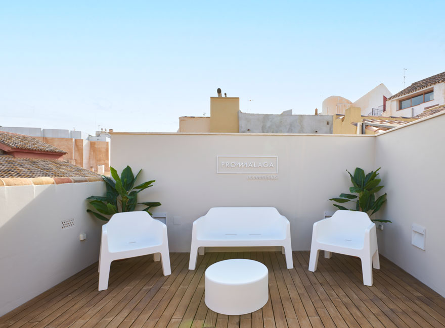
It is distributed over four floors: ground floor plus three. The office building includes offices for independent professionals and co-working spaces, as well as meeting rooms and an assembly hall, which can be extended by means of a movable partition wall as required. It also includes other common areas such as the terrace and the office.
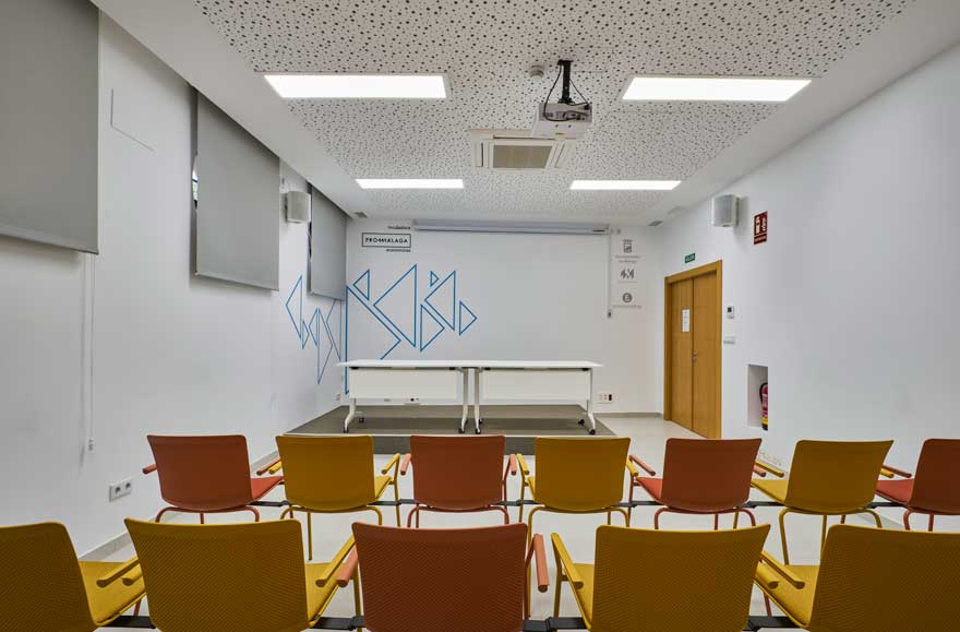
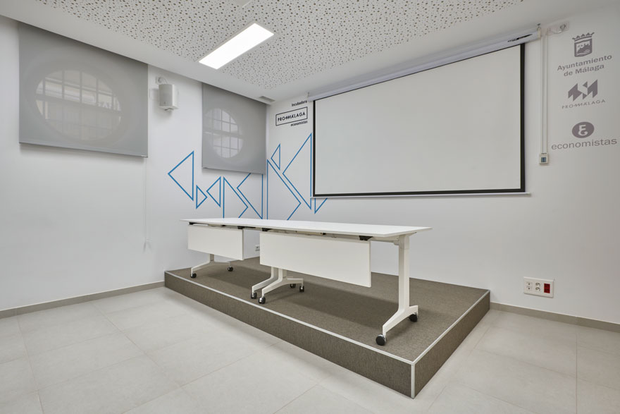
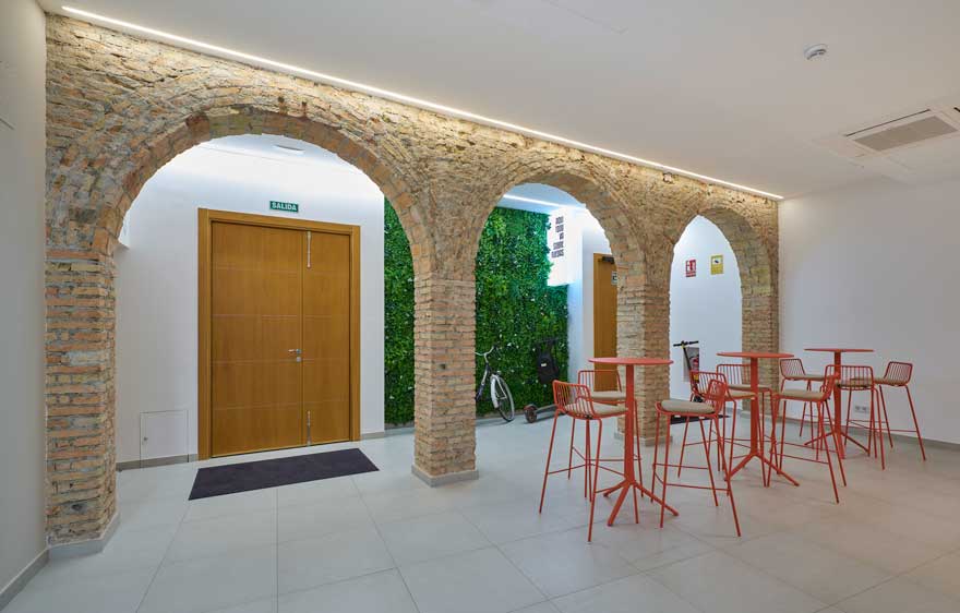
The building has been refurbished respecting and preserving the valuable historical construction elements present in the original building. Such as the original ceramic brick walls or the characteristic round arches in the entrance hall.
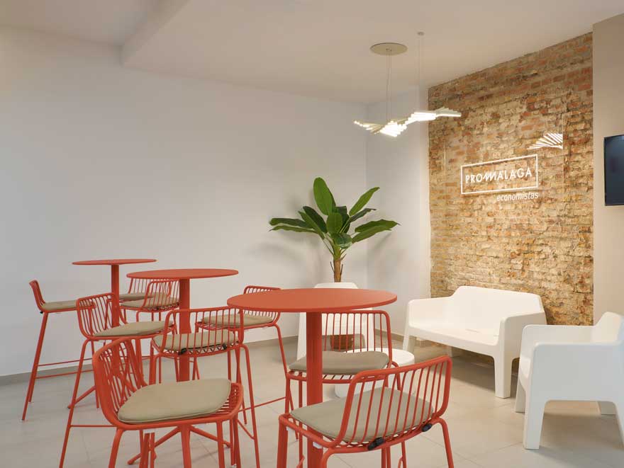
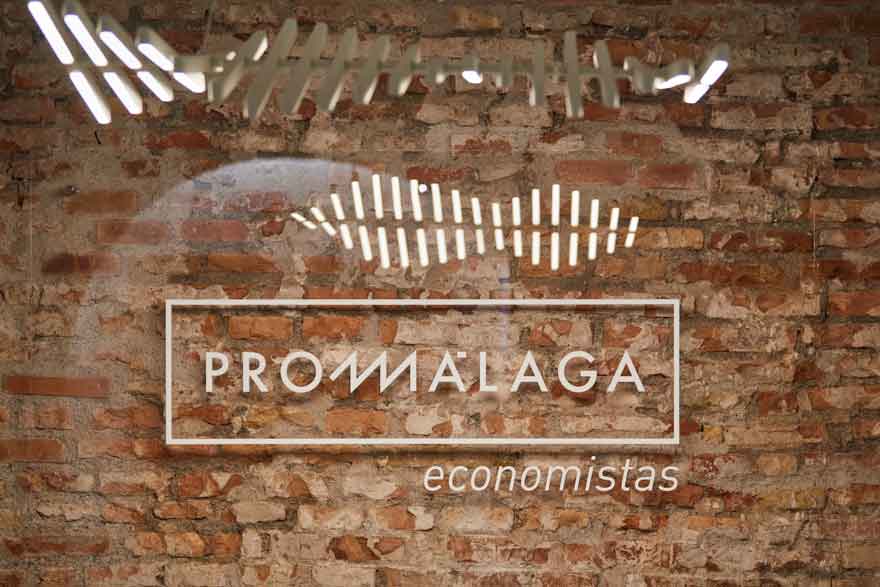
Faced with these architectural pre-existences, we opted for an elegant office design with a neutral interior, unique lighting and the enhancement of the aforementioned historical building elements. In contrast, a colourful, geometric branding makes it a unique corporate office.
corporate office and design concept
Being very conscious of the sensitivity of the building’s refurbishment, the challenge was to apply the brand to the space, conveying elegance, professionalism, simplicity and sophistication; an example of space branding applied to office design.


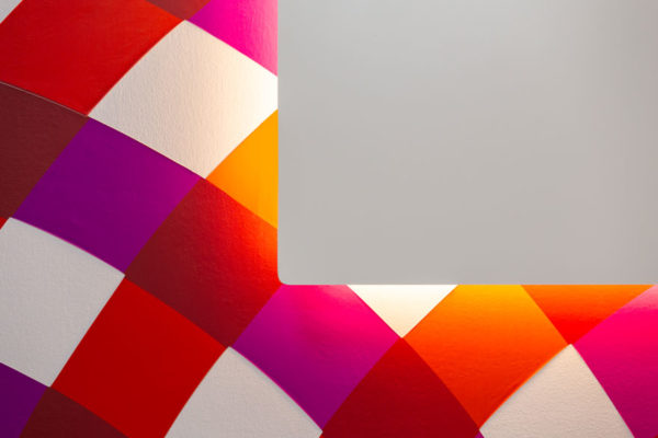
Based on this premise, the brand was reinterpreted. A brand universe characterised by vibrant colours and geometric shapes that reflect the energy and drive of the company.
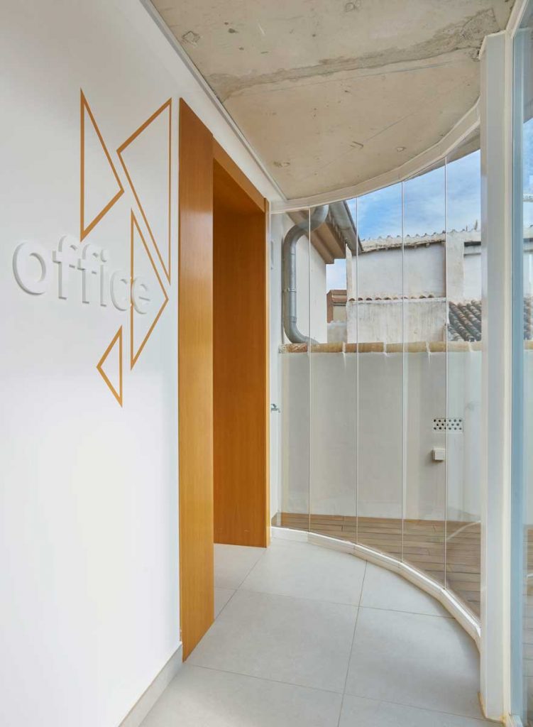
Geometric shapes are refined and become more sophisticated, moving from solid coloured triangles to outlines in the form of triangular wire structures.
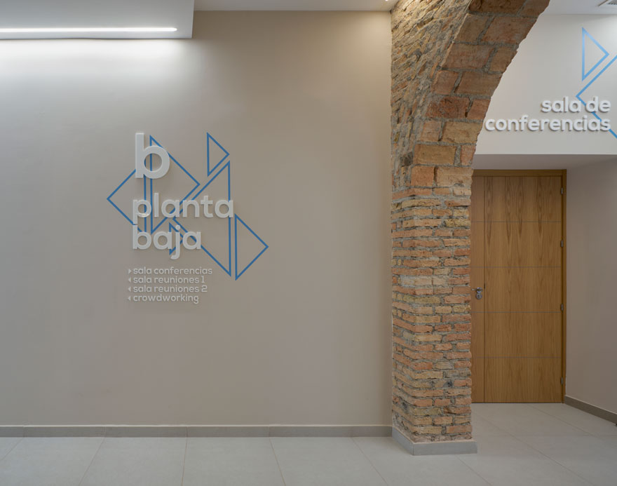
In this way, the triangular geometry continues to be present in light elements without weighing down the space. And on the other hand, colour becomes a very controlled tool that places the user within the building, while bringing the freshness and vitality of the brand.
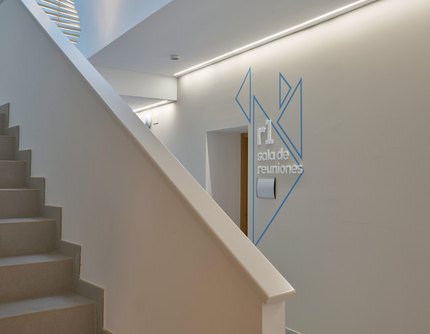
corporate signage design
For the design of the signage of this corporate office, we played with the balance between colours, masses and shapes.
Firstly, rules of the game are created where the signage on the architectural pre-existences is in white. In this sense, white and methacrylate are the prevailing materials.
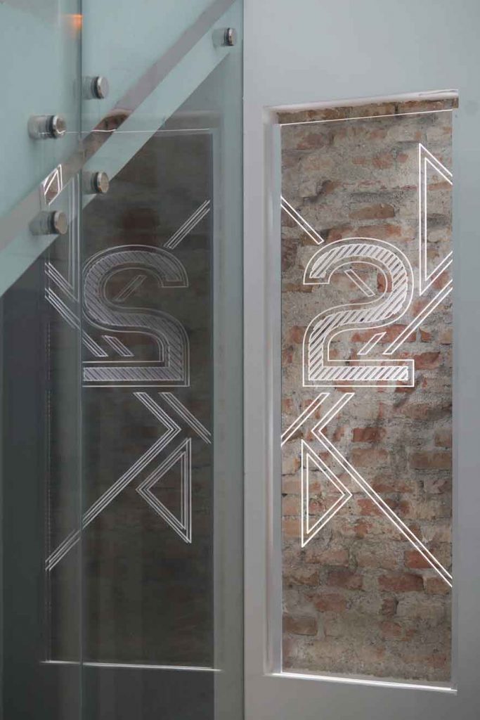
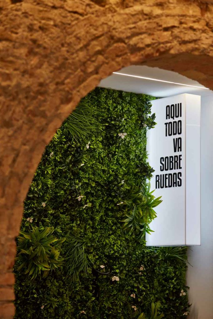
As a result, signage elements such as logos or plant lists are created and superimposed on original brick walls that abandon colour and are dominated by transparent methacrylates and light. A play of transparencies where tradition and modernity merge.
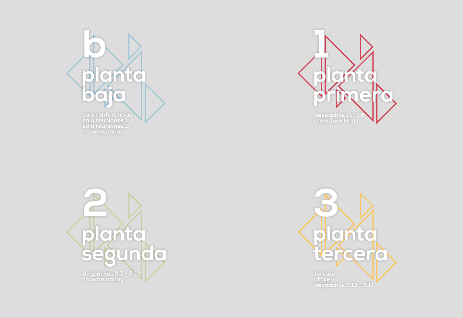
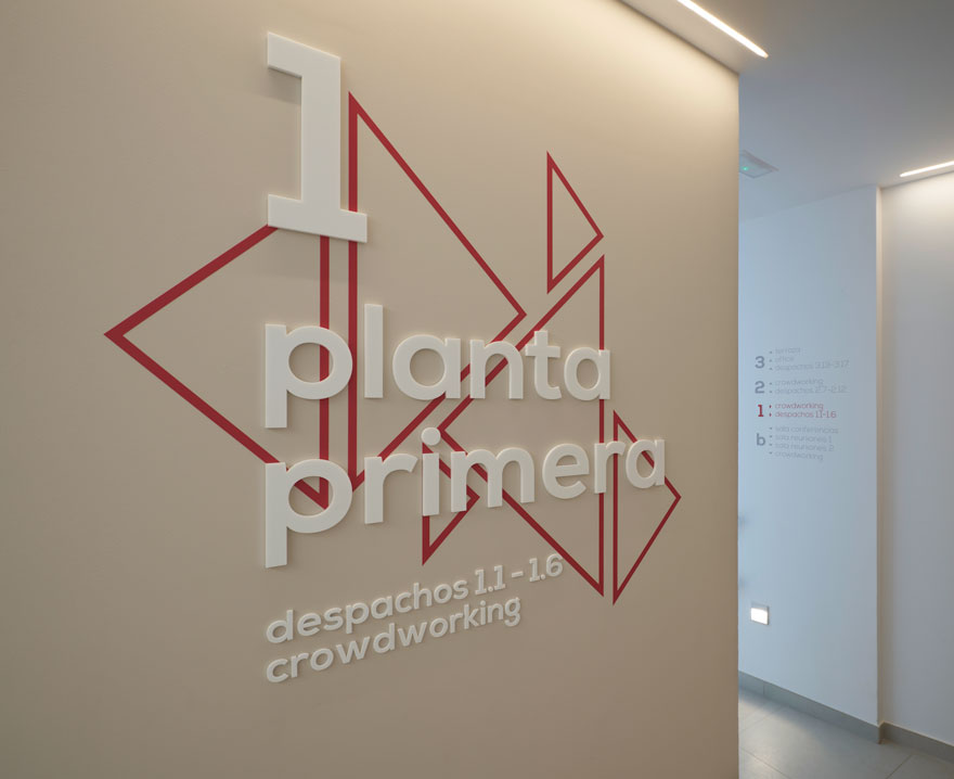
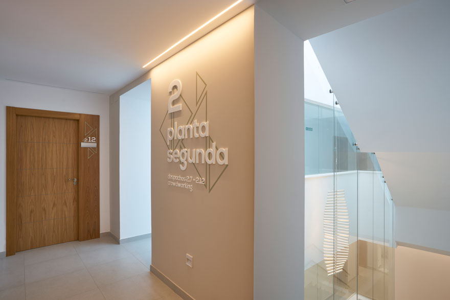
Secondly, the corporate colours are subtly present in the common areas, as they serve to identify each floor of the building. To this end, compositions are created where numbers and letters in neutral tones are superimposed on colourful geometries, creating greater richness to the graphic universe of the brand.
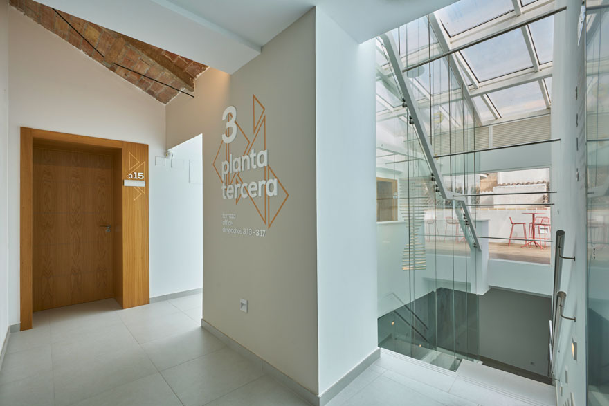
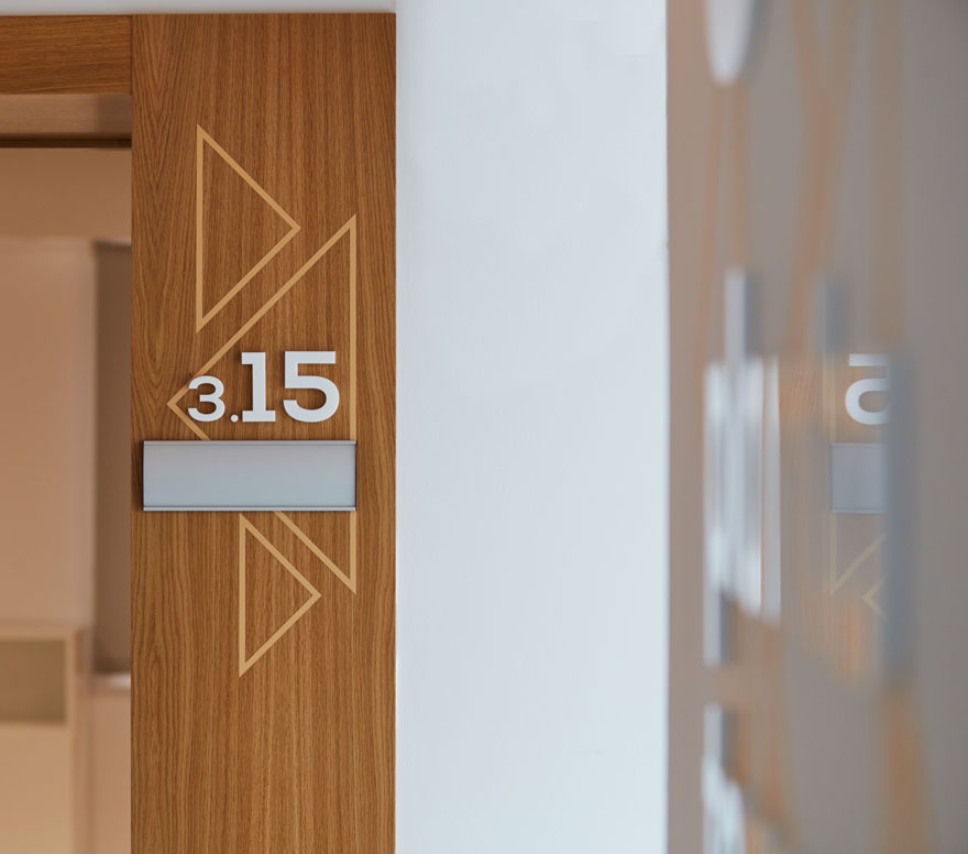
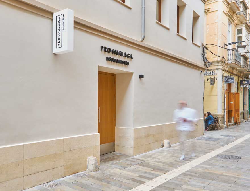
As for the exterior of this office building, an elegant monochrome design enhances the design of the façade.
An exterior marked by the use of natural materials such as lime mortar and natural stones coexists with industrialised materials that give life to the corporeal logo at the entrance and the illuminated sign.
colour and furniture
The colour of the floor plan is also referenced within the offices, where one of the walls takes centre stage with colour in contrast to the neutral tones of the whole.
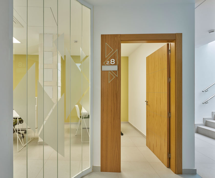
As for the furniture, all the offices have identical equipment with neutral, simple and refined lines. Lightweight furniture is used to enhance the architectural space, with a nod to the brand’s wired, triangular design. For example, the support elements of the office desks.
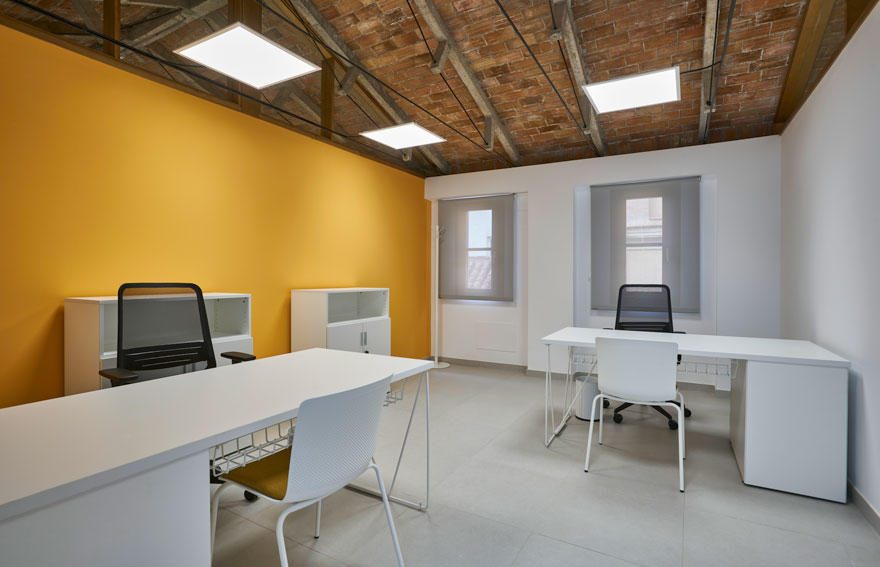
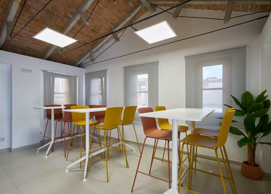
However, the brand’s play of triangles goes further in the design of this corporate office. It can be seen how the ceiling of the third floor has been left exposed, resolving the placement of the lighting fixtures with tensors that generate triangulations. The wooden trusses placed between the offices on the same floor also speak of this.
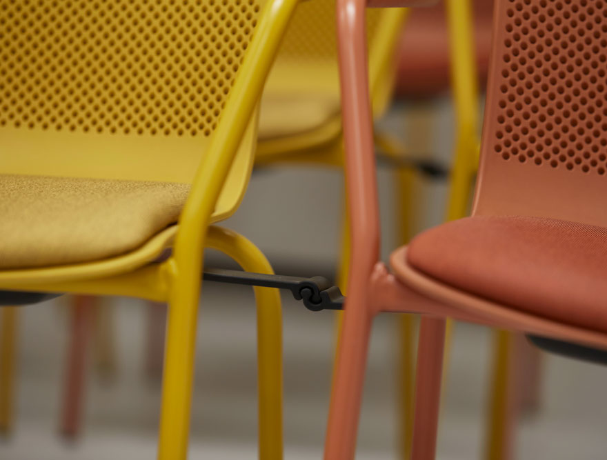
In the communal areas, the furniture takes centre stage, providing a touch of colour and contrast.
If you found this project interesting, you can go to see the previous project developed for Promálaga, a coworking building in Álamos street. Or you can also see other office designs.
