Miraflores de los Ángeles School not only decides to renew its graphic image, but is also committed to a comprehensive space branding project for the design for this school in Malaga.
need for change
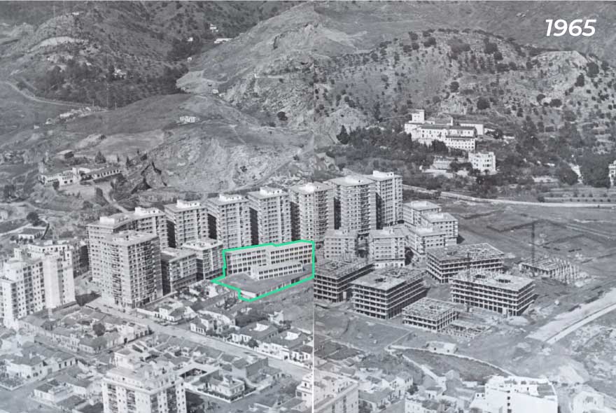
We are facing a school with more than 50 years of history, which is characterized as the generator building in the Miraflores de los Ángeles neighbourhood. A low-rise architectural volume that contrasts with the large exposed brick towers that surround it.
In this sense, the school has been and continues to be the heart of the neighbourhood. The engine that educates, shapes and encourage the new generations.
However, the huge exterior deterioration of the building and the outdated corporate image, motivate this new project.
the objective is to create a positive image of the school towards the neighborhood and the city
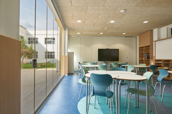
To do this, a new corporate image of the school is designed and transferred to the closest areas of the educational community: “the space“. In this way, the entrances, the corridors, the patio, the classrooms… are invading with the colour, dynamism and freshness of the new identity.
lay the foundations for the school design
In the first place, the scarcity of resources at this public school was one of the determining factors. So taking advantage of resources and doing the most with the least was the great challenge.
Second, the change is intended to improve the user experience of families, teachers and the students themselves. Because it is so important to promote changes, as to transmit them to the entire educational community.
And finally, seek and enhance the identity of the school, capable of motivating current teachers and students, and attracting new students. For this, the new corporate identity starts from the colours, the materiality and the configuration of the neighborhood and the school.
enhancement of the school through participation
Before launching into the school design, it is essential to think about the users, their degree of involvement and the feeling of belonging to it.
As was already collected in the project to renew its graphic identity, the project had a marked participatory nature from the beginning. This was decisive for, both students and teachers, identifying with the project and feeling part of the change.
Consequently, an extensive briefing was carried out for the teachers. Next, dynamic workshops were carried out with the students, where they worked on the school identity, making them participate in the co-creation of the new corporate identity.
And finally, it is worth highlighting one of the leading projects: the school garden.
Thanks to the workshop given by BeeGarden, the students learned the importance of pollination and seasonal species, participated in the start-up and, from now on, will be responsible for their care.
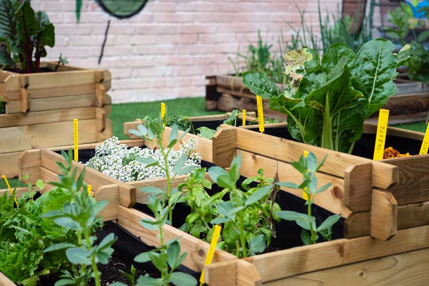
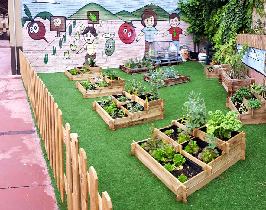
With all this, values such as respect for nature, care, teamwork and individual responsibility are promoted.
space branding
Within the space branding project carried out, we distinguish three types of actions.
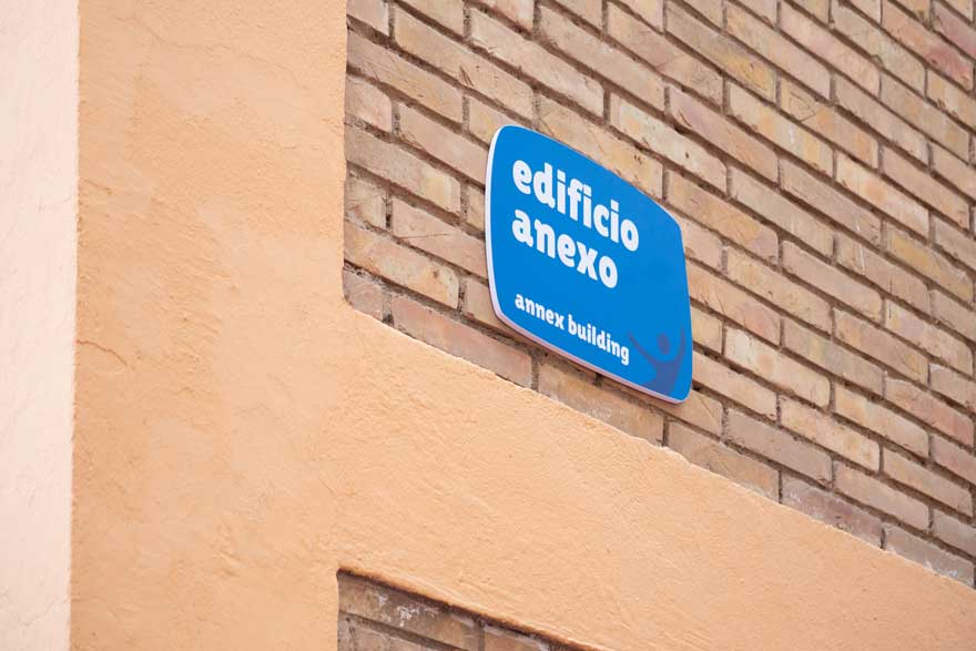
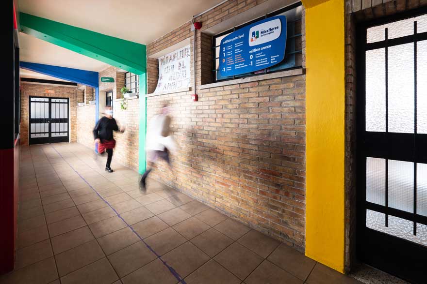
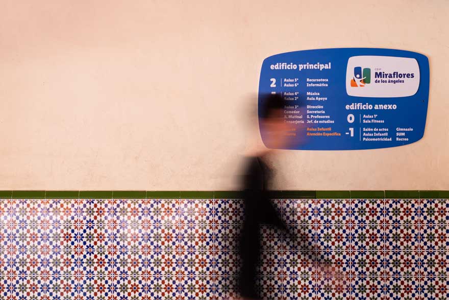
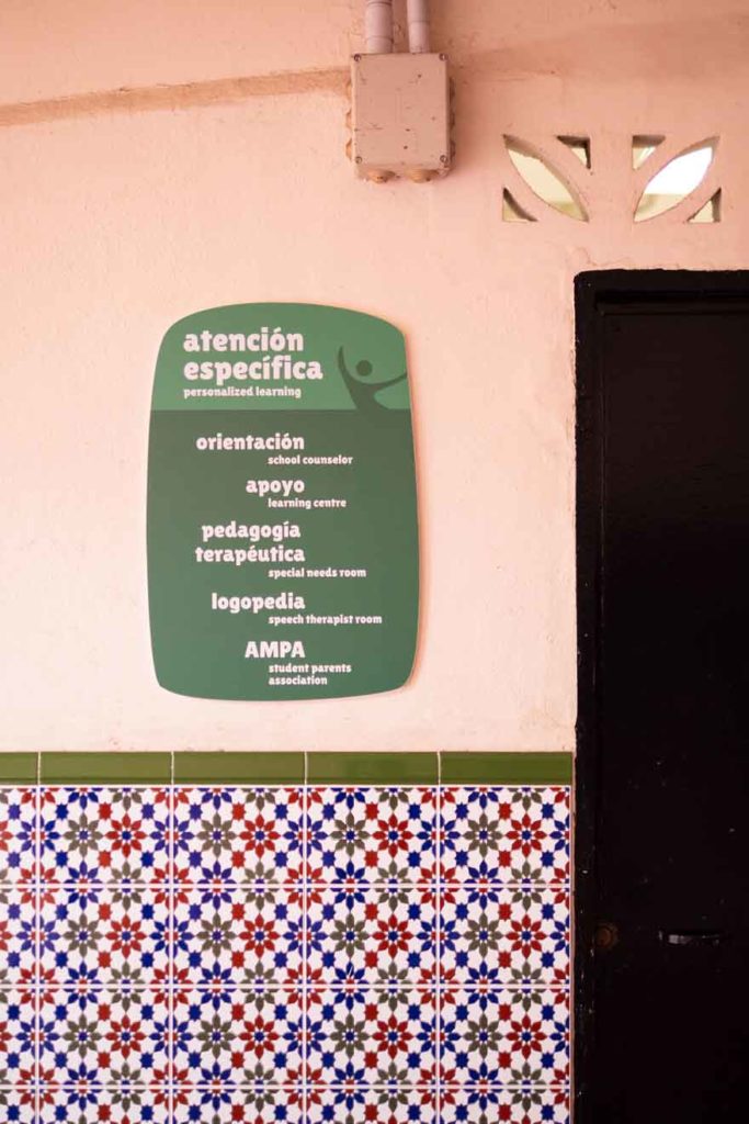
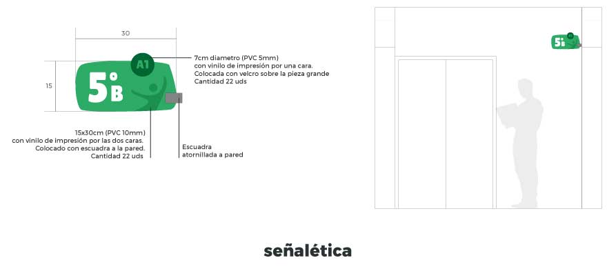
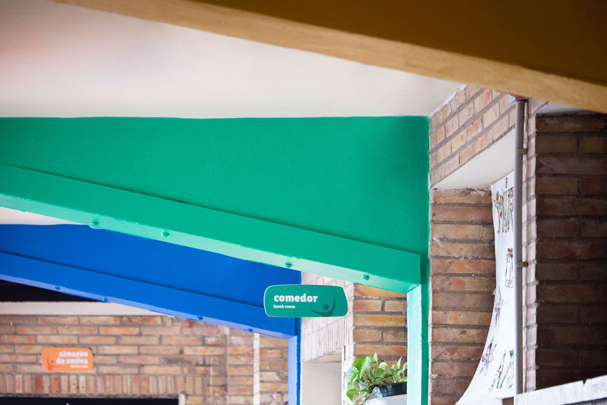
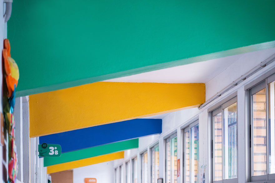
Firstly, it is worth highlighting the performance related to functionality within the centre. In a school design of this size, it is essential to ensure that the user is oriented at all times.
For this, the design of the school’s corporate signage is developed, according to the new brand identity.
In addition, its function of categorizing the different types of spaces through colour improves the user experience, especially for children.
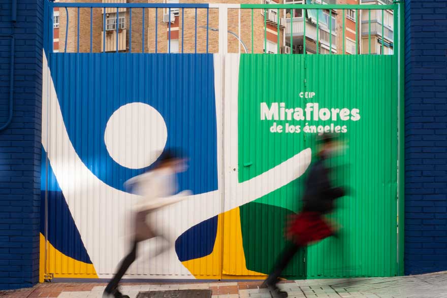
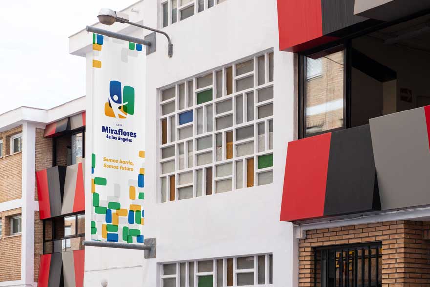
Secondly, decoration performances are developed. The objective is to apply the brand to the space and for the new corporate colours to invade the school.
These small interventions transmit the new graphic identity, both within the school facilities and towards the neighbourhood. They are identifying elements that make the school recognizable and memorable.
The intervention is accompanied by the design of corporate canvases with the recent logo design and the new motto of the school:
we are neighbourhood, we are future
CEIP Miraflores de los Ángeles
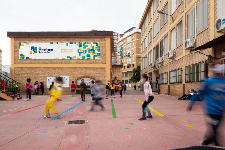
Finally, the school entrances are designed. In a year marked by Covid, any hitherto secondary door becomes a new main access to the centre.
In this sense, they become new blank canvases perfect for implementing the corporate identity of the school and showing the change towards the neighborhood and towards the city.
360º school design
As a result, a comprehensive school design, where they have worked from graphic identity to interior design. In short, one more example of space branding.
As a culmination of the project we produced a video, where in addition to telling the different actions of the project, it will help the school to communicate the changes to the entire educational community.
A 360º design project of which you can see the first part in the following link:
Brand identity of the Miraflores school.
If you are interested in discovering other space branding projects, we encourage you to continue browsing our website.