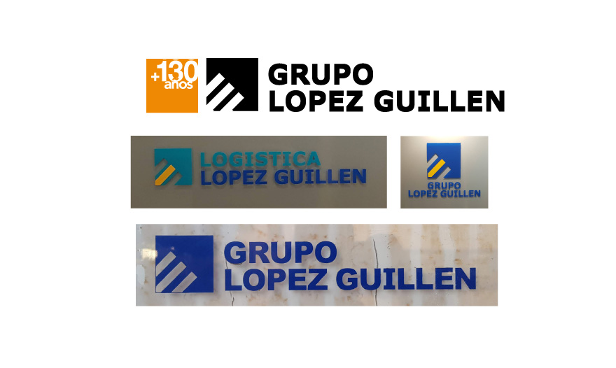
In the creation of the logo and brand for Grupo López Guillén, the main objectives were two. On the one hand, to combine the different variants of logos with which they were shown, and on the other, to unite under the same image the group of companies that it represents.
It is a group that brings together leading companies at a national level in comprehensive logistics and manufacturing and marketing of construction materials. Based in Almería and with more than 100 years of experience, they wanted a corporate identity at the height of their professionalism.
Their starting brand was diluted between the variants of logo and colors they used. And although the differences were subtle, it detracted from its image. The challenge was to make a redesign that would reinforce them. A design with which they would continue to feel identified and that would represent the group of companies dedicated to different fields.
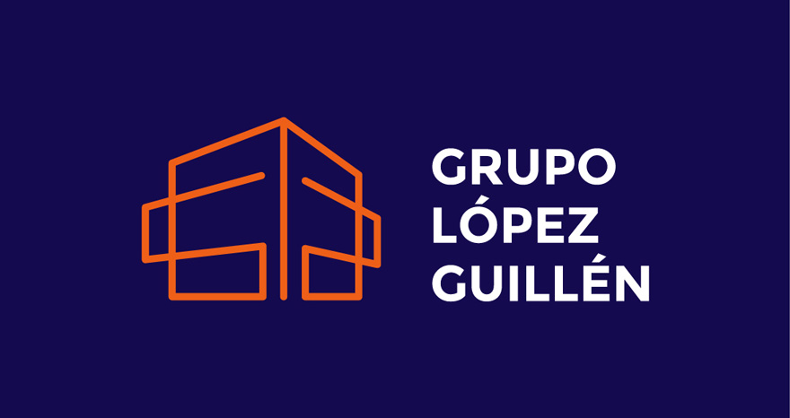
the brand
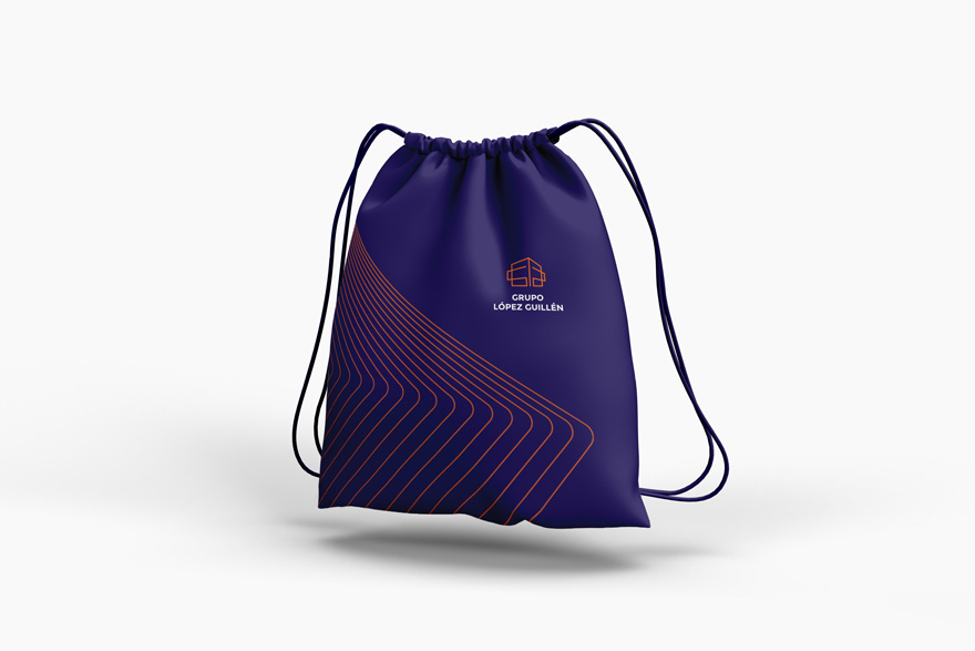
We conceived a design that revolved around the concept of a building. This is a symbol of a corporation and a large company. It also helps to communicate the recent construction of its new headquarters in the port of Almería, in which we are also designing the spatial branding. In addition, the lines and perspective have also been played with to hide an “L” and a “G” in the isotype, in addition to providing movement to the whole.
As for the font, a sans-serif font is chosen in its Bold variant. So, the result is a typeface that is easy to read and is a symbol of transparency and order.
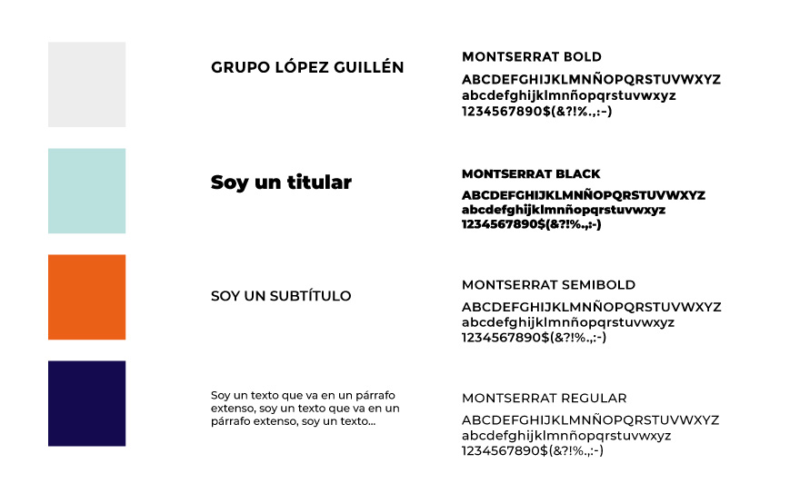
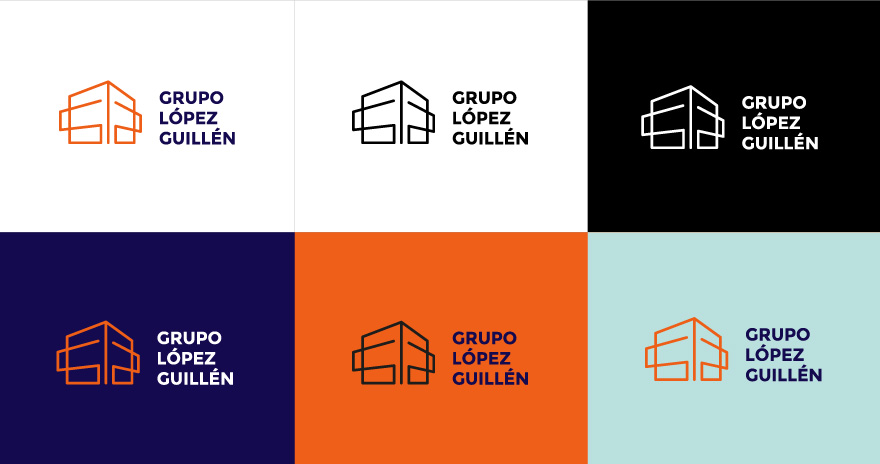
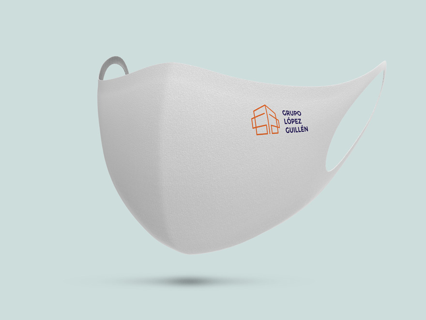
The brand is complemented by a modern and vibrant palette, which aims to convey confidence through calm blue-purple, and dynamism and energy through orange.
A logo creation that seeks to make Grupo López Guillén recognizable for its more professional character.
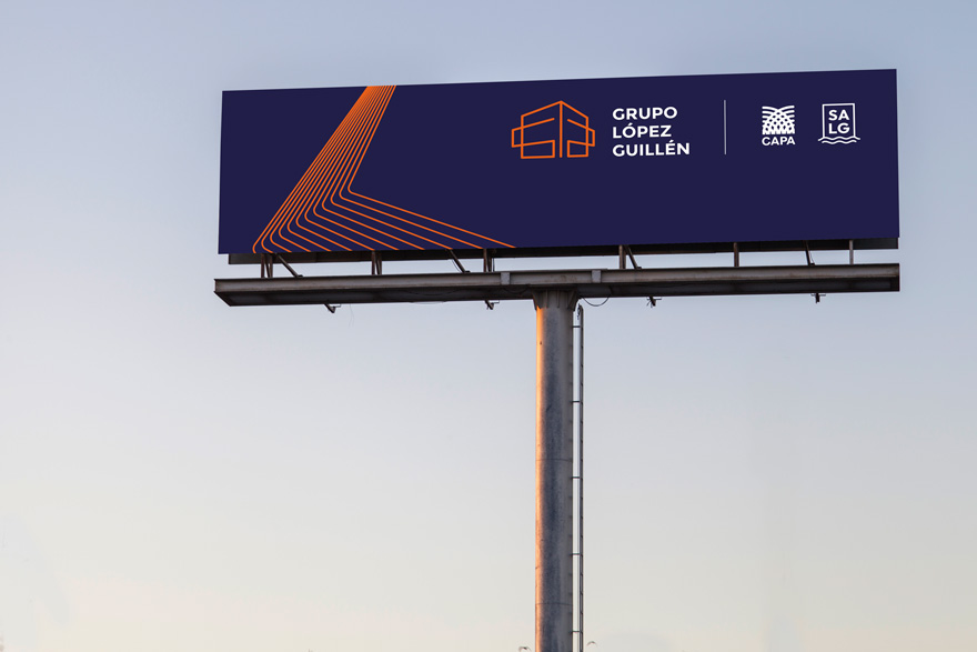
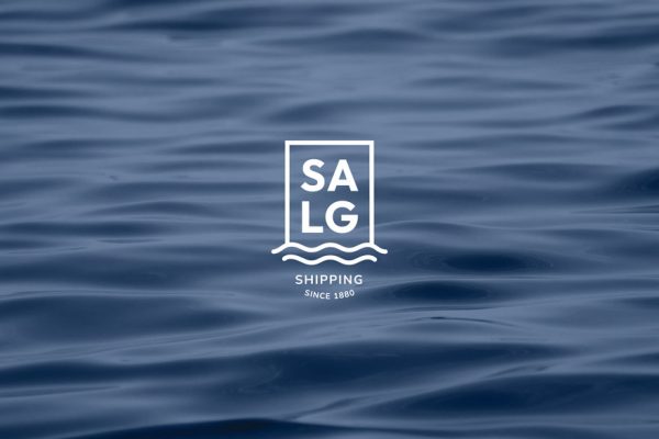
If you want more information, you can go to see the new corporate image of Salg, one of the companies belonging to the López Guillén Group.
You can also see more about brand design that we have carried out in this link.